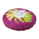
I love spring! To me spring is all about colours. Bright colours. At this time of year I notice that the sky is bluer. A true blue. I think colour is so impacting right now probably due to the fact that we have been living in the dullness of a long winter. Whenever I spot a bright colour I am instantly boosted. (Must try to bottle this feeling) With that said I am changing the throw cushions on my sofa and adding pops of colour throughout the house. This year I seem to have an affinity for yellow chartreuse. Although I am noticing that pink (very vivid pink) is really hot right now with everything from home accessories to magazine artwork. Pantone, (www.pantone.com) the world-renowned authority on colour, has identified Honeysuckle, a dynamic, reddish pink as the 2011 Colour of the Year. I change my throw cushions often because I have many different cushion covers and I use the same feather pillow inserts. I use IKEA (www.ikea.com) feather cushions and buy their covers or sew them myself with great fabric. Also WEST ELM (www.westelm.com) sells the inserts and covers too. Big change, little impact on storage. Recently while travelling the public transit I noticed that the majority of people were wearing black, grey or brown. From their coats right down to their shoes. Very dull. Which made me think, wouldn’t it be great to have a day where we all wore a visibly and vividly bright piece of clothing. How very mod! Remember when you where a kid and you got a brand new box of crayons? You would open that new box and all the bright colours were in the front row of the box and all the dark colours were at the back. The yellow, pink, red, orange, lavender, citron, turquoise blue at the front and the black, brown, grey, hunter green, navy blue at the back. So here is to spring and to all the front of the box colours!
MODMISSY
Design is Everywhere


very well done!! good info and visuals