Only One Idea?

Has it ever happened to you where sometimes you just run out of ideas?  Like, “OMG, what should I make for dinner tonight?” or “What should I get X for their birthday this year?” or “How should I entertain the kids this weekend?”  Really very small decisions when it comes to the grand scheme of things but most likely you will try to switch things up as variety is the spice of life and as I always say ‘change is good’.  Which is probably the reason why the other day while sitting at a traffic light waiting for the light to change I looked down a side street and I was dumbfounded? I made a quick U-turn as I just had to get a closer look.  What I noticed was that on both sides of the street all the houses (more than 40) were identical.  They were perfectly aligned; every rooftop, every peak, every window, every porch, everything!  There were slight colour differences but other than that these homes were all the same.  Total carbon copies.  I could understand if these truly were row houses but they weren’t, they were all detached homes built identical to the one next to it.  It made me wonder, did the builder/architect/designer run out of ideas after the first design?  Did the idea of altering a roof angle or a window dimension or a street setback never make it into the design strategy?  Did someone believe that the one design was good enough so let’s repeat it over and over and over and over?  I understand running out of ideas for dinner but really…!  As I wrote before ‘good design is obvious, great design is transparent’.


Great Design is Transparent

Good design is obvious, great design is transparent’.

I came across this quote some time ago and have had it in the back of my mind pondering its meaning.  I have come to a conclusion that for me this quote means….Good design is obvious, it has accountability, and great design is transparent because it functions in a manner not evident to the user whereas by contrast bad design has no accountability nor does it function well.  Let me explain myself.

Three different homes I’ve owned have been 2-stories.  Three bedrooms and a bathroom on the second floor.  Makes sense, very standard.  Obvious good design.  But where great design should have been transparent was the bathroom door not located at the top of the stair directly in line (and view) of the front door.  Instead in all three homes the house was designed so that the front door, stairs and bathroom door were all aligned so that when you sat on the toilette or stepped out of the bathtub you were in plain sight of anyone who came to call at the front door.  And you know that doors are always left open.  Terribly embarrassing.  Where was the design accountability because this layout certainly had poor function?  What was the designer, architect or builder thinking or rather not thinking when they planned the house?

In my recent home we renovated the bathroom (see my post – My Bathroom Reno) and tore the bathroom wall down to move the bathroom door over so that it was not aligned with the front door.  Great idea.  Now, no one will ever now that the bathroom door was ever in the wrong place because ‘great design is transparent’!

Hosting and Boasting

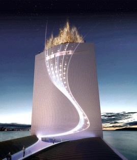
Winning the bid to be the hosting country for the Olympics is nothing short of outstanding; a gold metal accomplishment.  As Olympic athletes prepare for their competition, the competition is also on for the hosting country to present a spectacular display of their abilities.  As our world has advanced in knowledge and technology so have the Olympics with countries showcasing their leading-edge innovations in architecture, design and construction.  Rio de Janeiro will be hosting the next Summer Olympics in 2016.  Rio is not only the first South American country to be hosting the Summer Olympics but they are also planning to be the first zero-carbon footprint Olympics.  To help Rio achieve this goal, Swiss-based RAFAA Architecture and Design has designed the ‘Solar City Tower’; an eco-architectural solar waterfall.  Solar panels will capture solar energy and falling water will stimulate turbines to produce hydro energy.  The proposed structure is both beautiful and green. 

Solar City Tower built atop the island of Cotonduba.

The view from the air as visitors arrive. 

Solar City Tower will also hold the Olympic flame.


Solar City Tower will be the point of reference for the 2016 Olympic Games in Rio de Janeiro.  I am keeping my fingers crossed that all goes well and the Solar City Tower truly becomes a reality.  Definitely something to boast about!

    Images via RAFAA

NYC Skyscrapers

A city is not just a place or a group of people; it is also about the physical structures.  The buildings, roads, transit lines and the entire infrastructure intertwine to create the most wonderful artwork, a canvas painted by millions of artists.  And so it is with New York City.  NYC is defined by its skyscrapers; it has more tall buildings than any other city in the world, and pioneered many of the construction techniques necessary to build them.  Some of the well-known skyscrapers are the Empire State Building, the Chrysler Building, 40 Wall Street, the G. E. Building (Rockefeller Center), and up until 2001 The World Trade Center Twin Towers.  I had a chance to visit Ground Zero where the former World Trade Center once stood.  Times Square has always been an iconic landmark and a symbol of NYC that draws thousands of people each day but after visiting Ground Zero and seeing the masses of people visiting this site and paying homage, one can feel that there is now a huge heartfelt pull of the masses to Lower Manhattan.  The feeling I got while walking around Ground Zero was that of unity and togetherness; a sense of closeness.  You talked to people not strangers.  It was like bumping into a relative or an old friend.  Everyone on the street shared in the same loss.   I heard peoples’ stories and also learned interesting things such as the master plan architect for One World Trade site’s redesign is Studio Daniel Libeskind.  (Same architect as the recent renovation of the ROM)  The new ‘Freedom Tower’ will rise to the symbolic height of 1,776 feet, the year in which the United States Declaration of Independence was signed.  I also learned that the Empire State Building in 1945 and 40 Wall Street Building in 1946 were both accidentally hit by planes.  

WORLD TRADE CENTER RE-BUILD

       ROCKEFELLER CENTER

          ONE WALL STREET


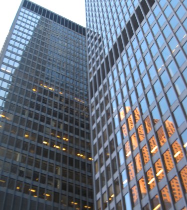
TD Centre

I am home from Chicago.  It was a ‘whirlwind’ trip as there is so much to see and do (and eat) in Chicago.   Chicago to me is all about the architecture and the food.  The variety of restaurants/food in Chicago is incredible.  And for a very large city Chicago is quite affordable.   Back in Toronto one must not forget that Toronto too has great architecture.  The Toronto-Dominion Centre, designed in the International style by Mies van der Rohe, consists of six towers (TD Tower, Royal Trust Tower, Canadian Pacific Tower, TD Waterhouse Tower, Ernst & Young Tower, 95 Wellington Tower) and a pavilion (TD Banking).  The original TD Centre designed by Mies consisted of two skyscrapers (TD Tower, Royal Trust Tower) plus the banking hall.  The TD Tower was the first phase to open and symbolically dedicated on July 1st, 1967, Canada’s 100th birthday.  The TD Centre were the skyscrapers that put Toronto on the architectural map and changed the city’s skyline forever.   At 56 stories, the TD Tower is the tallest Mies van der Rohe building in the world!  It was Mies’s last major work before his death in 1969.  The TD Tower had an observation deck on its top floor but it was closed to the public when the CN Tower was built in 1976.  I love walking around the financial district in Toronto and looking (looking way up) at these tall and impressive buildings made of steel and glass that reflect the skyline from them.  Sometimes it takes a trip away to realize what is right in front of you!

      Toronto – Mies van der Rohe


Chicago Skyscrapers

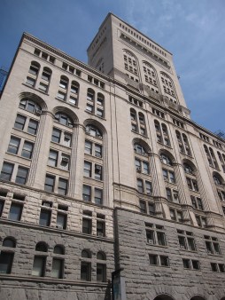
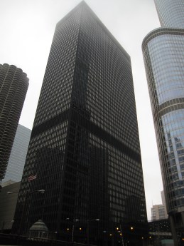
While in Chicago I recommend doing the Chicago Architecture Foundation (CAF) Walking Tours.  Listed as one of Chicago’s top ten cultural destinations it is a great way to learn about Chicago.  Chicago is not only the birthplace of the skyscraper, it is also where most of the innovations in early skyscraper design and technology originated.   The CAF is located right on Michigan Avenue near Millennium Park.  I went on 2 tours; Historic Downtown-Rise of the Skyscraper and Modern Skyscrapers.  The Historic Skyscraper tour includes buildings built right after the 1871 Great Chicago Fire up to The Great Depression.  The tour points out the 3 architectural designs of the time – Chicago School of Architecture, Beaux-Arts and Art Deco.  Looking at these incredible tall structures I had to remind myself that some were built in the 1800’s!!  Such innovation!  The Modern Skyscraper tour includes the years following World War II when Chicago established itself as a world-renowned city for Modern architecture.  The tour points out the birth of the Mies van der Rohe minimalism (“Less is More”) to the rise of Postmodernism (“Less is a Bore”).   After the tours I had an appreciation for a city that is more than just about a great shopping, baseball and hockey destination.  Instead of just looking into the shop windows on Michigan Avenue and ‘The Magnificent Mile’ I started to look up and appreciate the history and beauty of Chicago.

        Historical Skyscraper


     Modern Skyscrapers 


The Mag Mile

I can now say that I have experienced the typical ‘windy city’ Chicago day with wind and rain that made my umbrella turn inside out.  But yesterday was a beautiful, clear and sunny day that was perfect for walking up Michigan Avenue North and taking in all the sights along the ‘Magnificent Mile’.  Lake Michigan is on the east side of the city (compared to Toronto with Lake Ontario on the south end) and the city is laid out in a grid system so it makes it easy for a tourist to navigate and find their way around downtown.  Heading up the ‘Mag Mile’ I stopped at Millennium Park, an award-winning outdoor cultural centre for architecture, sculpture, music and landscape design.  It is a ½ acre gathering place located in the heart of downtown Chicago.  The big drawing card to Millennium Park is  ‘The Bean’, a stainless steel, highly polished, huge (66 ft x 33 ft x 42 ft) bean-like sculpture.  The sculpture’s surface has no visible seams and it reflects and distorts Chicago’s skyline.  Great photo ops!  I continued up Mag Mile and could have stopped and shopped at every conceivable retailer imaginable (one reason it is called The Magnificent Mile) but I did not stop or shop.  Instead I headed to the John Hancock Center (known as Chicago’s Greatest High) to ride the elevator (1000 ft in 40 seconds) to the top.  At the top you get a breathtaking 360 degree view of 4 states – Illinois, Michigan, Indiana and Wisconsin.   I recommend going to the ‘Signature Room at the 95th(no charge) instead of the Observation Deck. ($15 per adult)    At the Signature Room the views of the Chicago skyline are outstanding; it is the perfect place to take amazing photos plus you can have a cocktail while admiring the view.  And as I like to say when 95 floors above the ground, “I would rather be holding my glass than standing on glass!!”  Cheers!

           View of Chicago Skyline at The Bean, Millennium Park    


           View from the Signature Room at the 95th, John Hancock Centre


Frank Lloyd Wright – Oak Park

While in Chicago I visited the Frank Lloyd Wright Home and Studio in Chicago’s Oak Park neighborhood.  This was Wright’s first home and studio; the birthplace of an ‘architectural revolution’.  Wright built this home (for his wife and six children) in 1889 to explore design concepts that contained the beginning of his architectural philosophy.  In 1898 Wright added his studio on to this home and it was here that he developed a new American architecture – the Prairie style.  In 1889 Wright purchased a vacant lot in a neighborhood where the other homes were all Victorian in design.  As I stood outside looking at this home I could only imagine the controversy that this house created as it was so contrasting different from all the other homes around it.  What would the neighbors have thought?!  There must have been an outcry at this ‘unusual’ looking building.  This was after all the 1800’s.  The home’s exterior is dark and severe looking.  But on the inside the home is roomy with space that is well used and very bright.  Frank Lloyd Wright captured sunlight and nature in his home with windows that were strategically placed and skylights.  Wright actually built a living, growing tree that was on the lot into the home’s interior.  It is a common misperception the Frank Lloyd Wright’s home are minimalistic, but in fact there is a high attention to detail in them which was prevalent with Oak Park.  And as Frank Lloyd Wright once said “A building is not just a place to be. It is a way to be.”
 
           Neighbour to Frank Lloyd Wright Oak Park Home – 1898


    Frank Lloyd Wright Oak Park Home & Studio – 1898    


Crystal Clear Design

Few things in life are ever crystal clear.  But clear crystal is a beautiful thing. The beauty in crystal lies in its clarity and it’s perfectly symmetrical design.  The sparkle, the bling factor makes crystal appealing and eye-catching.  Think crystal chandeliers, crystal decanters, the crystal ball and most recently the liquid crystal display (LCD) television.  So why is it that ‘The Crystal’, the new Daniel Libeskind architectural expansion at the ROM (Royal Ontario Museum) is so controversial?  Cantilevered out over Bloor St. in downtown Toronto, the Crystal’s overall aim was to provide openness and accessibility and to transform the entire museum complex into a dynamic centre of people, events and artifacts.  To re-vitalize it.  The ROM was originally built in 1914 in the style of Neo-Romanesque and the 1933 expansion was built in the Neo-Byzantine style.  Both styles lean toward a heavy, fortress-like design.  The new 2007 expansion by comparison is very different and diverse.  Very outrageous.  But original and new.  Shouldn’t we begin to marry the old with the new?  Not hang around in the ‘Romanesque’ period but carve out a new path?  A new style.  Something that reads ‘Modern’?  Aren’t we in a new Millennium?  Shouldn’t we leave our own mark?  Let me know what you think.  Is ‘The Crystal’ a forward thinking design….or not??


Style Worship

Recently, I was driving along a section of St Clair Avenue East in Toronto’s east end and I experienced a major ‘rubber necker’ episode.  I am not of the common variety, ‘bad situation rubber necker’ but what made me turn my head was a great piece of architecture.  The building that I found so interesting was a church – Clairlea Park Presbyterian Church.  This church was not a large cathedral style church with high stained glass windows but rather a very simple, quietly understated church.  Its style is very contemporary in design and that is what appealed to me.  It was built in 1956 and still looks very present day modern.  Very cool!  The only windows on the east side are transom windows that sit right under the eaves.  The windows on the west side are of the same design as the clerestory windows but they run vertically instead of horizontally.  The windows were not stained glass but simple plain glass.  The roof is flat with only a slight slope which is unusual for a church. (think gothic or mansard roof)  This church had a ‘Frank Lloyd Wright’ feel to it.  I got back into my car and travelled a little east along St Clair Avenue and had another ‘rubber necker’ episode.  Thank goodness there was no traffic on this particular day!!  The second church that make me stop was – Scarborough Church of God.  Now by contrast to the first church this one was very different.  This also was not a large church but the pitch on this church roof was so steep it was incredible.  There are 5 dormers at the base of the roof with coloured glass windows.  Not stained glass. Very clean and simple.  The church was built in 1958.  Its style is Mid Century Modern.  I thought it was very interesting that two churches located so close to each other could be so unique in design.  They both warranted a closer look.  Now I am curious about what both the interiors look like so you know where I will be some Sunday in the near future!