Location, Location, Location

I love birds.

Cardinal

And I have written many times about birds on this blog.

https://modmissy.com/2013/01/24/trying-to-keep-warm/

https://modmissy.com/2014/06/04/robins-egg-blue/

I am mesmerized by how birds fly.

My fascination with flying started about 25 years ago.  This fascination ‘took flight’ while living in our first home where the bedroom was at the top of a long flight of stairs.  Not realizing at the time the importance of furniture placement, the head of the bed was placed next to the bedroom door which was just a few feet away from the top of the stairs.

Bed at top of stairs

It seemed that every night just as I was falling asleep I imagined myself floating out the bedroom door and flying down those stairs.  I was lulled instantly asleep.  Bliss.

But not everyone would find this flying exercise relaxing.  And having the bed in this position in their bedroom could be subliminal hell.

Hence the importance of furniture placement.

Recently while visiting a client she complained that she was not sleeping well in her new home.  The bedroom was situated at the front of the house.  The bed was placed on the window wall with the street just a few feet away.

To me it felt like sleeping on the road! Furniture placement.

We re-positioned the bed away from the windows (and the road),  Furniture placement

The client announced she is now sleeping much better.

One of the main principles of staging a home for real estate sale is furniture placement.  Too much furniture in a room and potential buyers feel crowded.  Furniture placed incorrectly; potential buyers are tripping leaving a lasting impression of a small home.

I always tell my clients that furniture placement is key and location, location, location is the most determining factor in the price of a home!

Oh Look…..it’s Me!

I went for a bike ride yesterday along Toronto’s waterfront bike trail.

Absolutely perfect weather and no crowds.

The bike trail was all mine to enjoy; very peaceful.  I pedaled along with nary a thought in my head.

Until I was quickly brought back down to earth when I saw a vision of myself posted on a billboard.

Freaky!!

Rollerblading

The likeness was uncanny even to me!                          Condo Billboard.

I’ve written previously about billboards, (see here) specifically billboards advertising new home developments with images of happy, smiling people living charmed lives but I never imagined I would be one of those people.

But there I was (or at least someone who looked a lot like me) rolling along the bike path, part of a new, vibrant, sustainable neighbourhood pictured in a huge billboard for all to see.  I had become that common face, the ‘this could be you’ person, living a life full of opportunities.  Charmed.

The billboard was part of the hoarding surrounding the upcoming Bayside Development.  The condos are being built directly on Toronto’s inner harbour of Lake Ontario transforming an underutilized, industrial area into an active and diverse mixed-use community and thriving waterfront destination.  With great views of the lake and a prime location to downtown Toronto who wouldn’t live a charmed life here.   Bayside Development

Toronto Inner Harbour

Fabulous, but am I ready for condo life yet!?

All images via Modmissy

Mies Times Three

While scanning through some files today I came across a few photos that made me realize I need to do some travelling – some more sightseeing.

Chicago Federal Building Mies van der Rohe

Kluczynski Federal Building


New York City Seagram Building Mies van der Rohe

Seagram Building


Toronto-Dominion Tower Mies van der Rohe

Toronto-Dominion Tower

Having the opportunity to play tourist in Chicago, New York City and Toronto, I got to experience 3 very different cities, but all with 1 architecturally similar skyscraper in their skyline.

The Kluczynski Federal Building (45-story) in downtown Chicago, the Seagram Building (38 story) in Midtown Manhattan and the Toronto-Dominiom Tower (56-story) in downtown Toronto were all designed by Mies van der Rohe.  All 3 of these buildings are of the International style in which the buildings’s structural elements are made visible on the exterior.

Ludwig Mies van der Rohe (March 27, 1886 – August 19, 1969) was a German born American who left his mark on the world in a very visionary, forward thinking, contemporary way.  And long before social media or technology!  Mies van der Rohe was an architect who was widely regarded as one of the pioneering masters of modern architecture.

These iconic skyscrapers that Mies van der Rohe dubbed “skin and bones” architecture still stand today as a testament to the adage “less is more”.

All images via Modmissy


Queen’s University

My son is in his final year of high school and now faced with the task of choosing a university to attend next year.  Selecting a university by program is important but I have come to realize that the ‘feel’ of the campus ranks very high too.  So we have been visiting campuses every weekend.  Recently our travels took us to Queen’s University in Kingston, Ontario.

Walking around the campus gives the best overview.

My niece (a Queen’s student) was our tour guide. Thanks Jen

Founded in 1841, Queen’s has a lot of historical presence.  Most buildings including all constructed before the 1960’s are faced with limestone giving many of Queen’s buildings a castle-like appearance.

Ban Righ Hall, opened in 1925, is the first student residence on the Queen’s campus that also provided dining facilities.  The historical dining hall could have been the inspiration for Dickens Oliver Twist, “Please sir, I want some more”.  Outside the dining hall’s large windows was terrace seating perfect for eating on a sunny day.

Goodes Hall, a 110 year-old Victorian schoolhouse, has been preserved into the Queen’s School of Business.

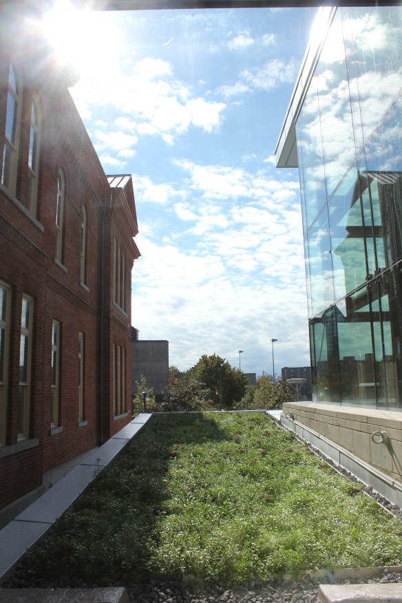
Blending the old with the new Goodes Hall recently expanded combining the history of the 1892 schoolhouse with the contemporary design of a 75,000 sq. ft. wing addition.

Much of the old architecture in Goodes Hall was maintained such as the grand maple staircase, maple wainscoting and tin ceilings.  Once again I felt like I was walking into an old movie set.

The old and new architecture blend together quite beautifully.

A ‘green’ roof bridging the two buildings together is very cool.  (pun intended!)

And to top it all off Queen’s University sits right on the shore of Lake Ontario so we finished our tour with a picnic lunch on the beach.  What’s not to love about a university on the beach!?

All images via Modmissy

Inspiration Board – or not!

I always get ahead of myself or rather get ahead of the project.  Whenever my husband and I renovate (and we have been doing that for over 20 years!) he is still in the ‘bust and build’ state while I am already decorating the space.

We are on track renovating our cottage, the drywall is up and the new window is in, the kitchen cabinets are assembled and the countertop is ordered.  But way before all this I have been buying fabric, rugs, furniture accessories etc. all the little touches that will coordinate the final presentation.  Make the finished space just ‘right’.

I pulled together my inspiration board which is always helpful to visualize the space.

I pictured our cottage done in white, warm wood, sisal and hits of blue to give a pop of colour to the space.  I choose Benjamin Moore Oxford White CC-30 for the walls (new drywall) which is a nice bright white.  The long wall across from the windows is paneled in pine.   The sofa is an existing Bauhaus sectional that we have had for years and works really well in the space.  The sectional is in a neutral weave fabric of which I replaced the back cushion covers with natural canvas.  I bought a new area carpet – IKEA Tårnby, a natural fibre carpet that has a great textural appeal giving the room a warm organic look.

To keep the room bright I bought 3 coordinating fabrics that I will sew into cushions for the sofa.  Crisp blue and white fabrics with lots of white accessories in the room will give a fresh, lakeside feel to the cottage interior.  I decided to replace the existing large upholstered (red) chair as its size was not appropriate for the space.  I wanted something light coloured and airier in appearance.  On Craigslist I found a leather IKEA Poäng chair (wish it was an Alvar Aalto Lounge Chair! – check out my previous  post here) which I thought would be perfect for the room.  Gotta love Craigslist!

Ok…..so I had it all figured out.  I knew exactly in my mind how this space was going to look.  WRONG!!!!

This past weekend when we started to put the furniture, carpet, etc. back into the cottage I realized the room looked nothing like my inspiration board.  I think my biggest miscalculation was the light.  The natural light that floods the room from all the windows changes the sense of the room.  The colours – paint and fabric, the furniture etc. all read very different.

And I love it!

So stay tuned……….


Metropol Parasol

Summer time to me announces ice cream season and what better way to enjoy your favourite flavour than atop a waffle cone.  Forget the Styrofoam-like cone and never out of a cup – I pay the extra $$ and always get the waffle cone.

In my neighborhood there is a small shop specializing in hand-made ice cream and last week I made a point of having my first ice cream cone of the summer season.

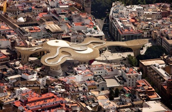
When I recently came across this photo of outstanding architecture I was reminded of my favourite waffle cone.

The Metropol Parasol is a unique infrastructure located in Seville, Spain in the old quarter district known as the Plaza de la Encarnacíon. The ‘Parasol’ scheme with its impressive timber/concrete/steel structure was designed by German architect Jürgen Mayer-Hermann and completed in 2011.  Standing at an impressive 26 metres high and 70 by 150 metres wide the building claims to be the largest wooden structure in the world.  Designed in 4 levels, the underground level houses the Antiquarium where Roman and Moorish remains discovered on the site are displayed.  Level 1, the street level, is the Market and Level 2 & 3 is where the panoramic terraces and a restaurant are located.  There is also a raised winding walkway that allows for amazing views of the cityscape.

The Metropol Parasol has become a new site of ‘identification’ for Seville as one of the most fascinating cultural destinations in the world today.  Its role as a unique urban space within the dense fabric of the medieval inner city of Seville allows for a great variety of activities and tourist locale.

And now another destination to be added to my ‘Must Visit’ list!

Images via J. Mayer H.


Choosing the Right White

Once upon a time………the decision of choosing the ‘right’ white was no problem.  Actually it never even occurred to me that more than one shade of white paint even existed!

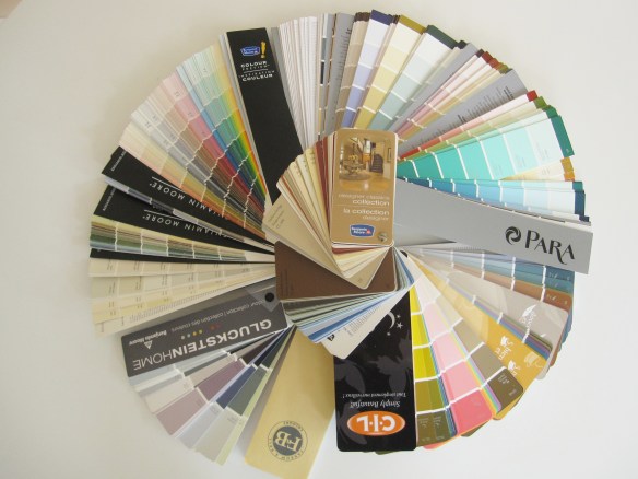
But now I pain myself over deciding the correct shade of white paint for my walls and trim.  And there are hundreds to choose from.  Dover White by Sherwin-Williams, Cloud White by Benjamin Moore, Cottage White by Behr, Natural White by Sico, Cameo White by Para; the list goes on and on.

When I bought my first home years ago and had to paint the walls there was only once choice of white paint – ‘D.J. Beige’.  Let me explain.  I had an uncle, Donald Joseph, affectionately known as D.J., who kindly offered his painting skills to each of us when we bought our first home.  D.J. would show up with his brushes, rollers, trays and gallons of paint.  I never knew the name of the paint D.J. had brought or even thought to ask.  It was just a ‘good’ colour that worked in all our homes.  It was D.J. Beige!

But now as I try to decide on the right white to paint the new walls of our cottage renovation I am puzzled.  What white will create that perfect feeling of relaxed calm lending itself to a weekend retreat that soothes the soul?  (That’s a lot of pressure on a paint colour!) I think I have my colour choices narrowed down so stay tuned.

PS.  Sometimes climbing a mountain is easier than choosing a paint colour!

That’s me – Mount Cascade, Alberta, Canada


The Ladies’ Lounge

I live in a neighborhood close to downtown Toronto nestled on Lake Ontario.  In the early 1900’s the neighborhood was used as a summer retreat for Toronto residents less than 10 miles away.  Large private homes and ‘cottages’ sprang up in the area which still remain standing today.  Many of the homes originally built were never intended to last 100 years – but they have.  Garages constructed to originally house buggies or Model T’s were narrow wooden structures built apart from the house.  One of these old wooden garages belongs to a friend of mine who I have named ‘Superwoman’.  Superwoman (SW) is capable of anything – she can leap tall buildings if she puts her mind to it.  SW has transformed her old wooden garage into a ‘ladies lounge’ – the female version of a ‘man cave’.  What SW started with was this:

And this.

At some point in the history of this garage a former owner had built a chimney and drywall the inside. (I suppose to use as a workshop.)  There were remnants of old linoleum on the floor and many, many holes where raccoons and squirrels entered to take up residence.  Of course SW had a lot of her own ‘junk’ in there too.  But once SW decided that this valuable piece of real estate could be better used there was no stopping her.  Out went the junk, the drywall was ripped down, the chimney was dismantled, the numerous holes were covered, the linoleum was pulled up etc. etc. etc.  SW had her work cut out for her.

But after many months of hard work the Ladies’ Lounge is finally ready.  Stay tuned for the reveal!

AZ Awards for Design Excellence

Last Thursday I attended Azure Magazine’s AZ Awards Gala Presentation at the beautiful Thompson Hotel in downtown Toronto.  The AZ Awards for Design Excellence celebrates with designers and architects from around the world the very best in international architecture, interiors and product design.

The event was generously presented by Keilhauer and Audi.  Sponsors included GE Monogram, George Brown College School of Design and Grange of Prince Edward County Winery.

The evening began with wonderful food provided by executive chef Robert Mills, award-winning Grange of Prince Edward County Wines and mingling with friends and colleagues.

Then we got down to the business of the evening – handing out the awards.

Hosting the awards presentation was Diana Swain, broadcaster/journalist for CBC Television.

A jury of 6 (contemporaries within the industry) had the tough job of selecting winners for 14 categories from 621 entries, representing 30 countries from around the world.

The AZ award trophy was made from cast glass designed by Jeff Goodman Studio.  Loved it!

As winners went up for their awards I could feel excitement and pride in the air akin to the Oscars or the Emmy’s!!  Talent is talent regardless of industry.  The caliber amongst these winners is outstanding.  Congratulations to all.

  • FURNITURE DESIGN: Waver Chair by Konstantin Grcic for Vitra, Switzerland
  • FURNITURE SYSTEMS DESIGN: New Logica by Gabriele Centazzo for Valcucine, Italy
  • LIGHTING DESIGN: 28d by Omer Arbel for Bocci, Canada
  • INTERIOR PRODUCTS DESIGN: Open Space, EOOS for Duravit, Germany
  • RESIDENTIAL ARCHITECTURE: InBetween House by Koji Tsutsui & Associates, Japan
  • ARCHITECTURE: COMMERCIAL <1000sq/m: Sunset Chapel, BNKR Arquitectura, Mexico
  • ARCHITECTURE: COMMERCIAL >1000sq/m: Nike Football Training Centre, Soweto, RUF Project, Canada
  • LANDSCAPE ARCHITECTURE: People’s Choice: Sugar Beach by Claude + Associés, Canada
  • TEMPORARY ARCHITECTURE: Infinite Variety: Three Centuries of Red and White Quilts by Thinc Design, USA
  • RESIDENTIAL INTERIORS: V4 House by Studio MK27, Brazil
  • COMMERCIAL INTERIORS: Alchemist Boutique by Rene Gonzalez, USA
  • UNBUILT CONCEPTS: Cottages at Fallingwater by Patkau Architects, Canada
  • UNREALIZED CONCEPTS: Multi-Sport Training Facility by Mark Horton Architecture, USA
  • A+ STUDENT AWARD: Polytropism: Tower Concept by Newsha Ghaeli & Caileigh MacKellar, Canada

The Cottage Renovation continues….

Winter time is ski season so the cottage renovation went on hold for a few months……..

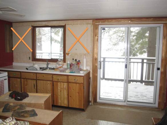
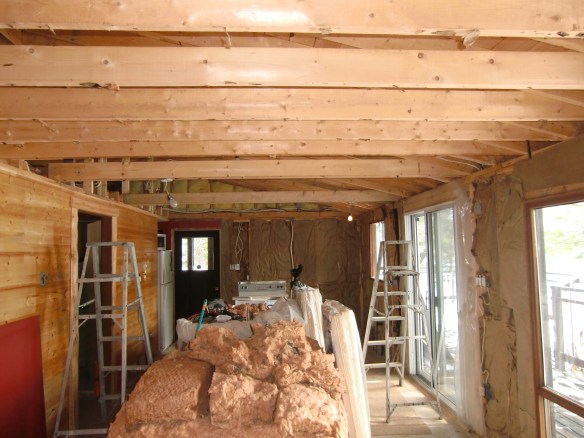
Fortunately the snow finally melted and work was back on.  Of course one thing lead to another and a small renovation became a bit larger renovation.  While moving the kitchen cabinets they literally fell apart due to age.  So we had to replace them.  While working around the kitchen window it cracked so we had to replace it.  The silver lining to all this is that it gave us the chance to re-think how we could improve the function of the kitchen/cottage.  We decided that the view was more important than storage so we opted to install a larger window over the counter and forgo the upper cabinets.

While researching new kitchen cabinets we decided that the original layout was a bit awkward with the stove blocking access to the last cupboard so we decided to design the new cabinets in an L-shape configuration.

No gut job is ever nice.

A photo from an issue of Canadian House and Home magazine featuring a space with a sloped ceiling and exposed beams with the combination of whites and wood provided some inspiration.

The renovation keeps moving along.  Stay tuned.