A Modmissy Creation

This past holiday my family (25 in total) did the gift exchange/swap thing – everyone brings a wrapped (hence the secret) gift with an approximate value of $10.  Depending on the number you pull from a hat you then chose when it is your turn to unwrap one gift or steal from a gift that has already been unwrapped and revealed.

Fun and chaotic, sometimes even turning into a bit of a ‘sport’!

This year in true Modmissy style I decided I had to create a ‘one-of-a-kind’ gift that reflected me.  Chocolates are de-lish and lottery tickets could be $$$$$$ but just not my style.

Here is what I decided to create.

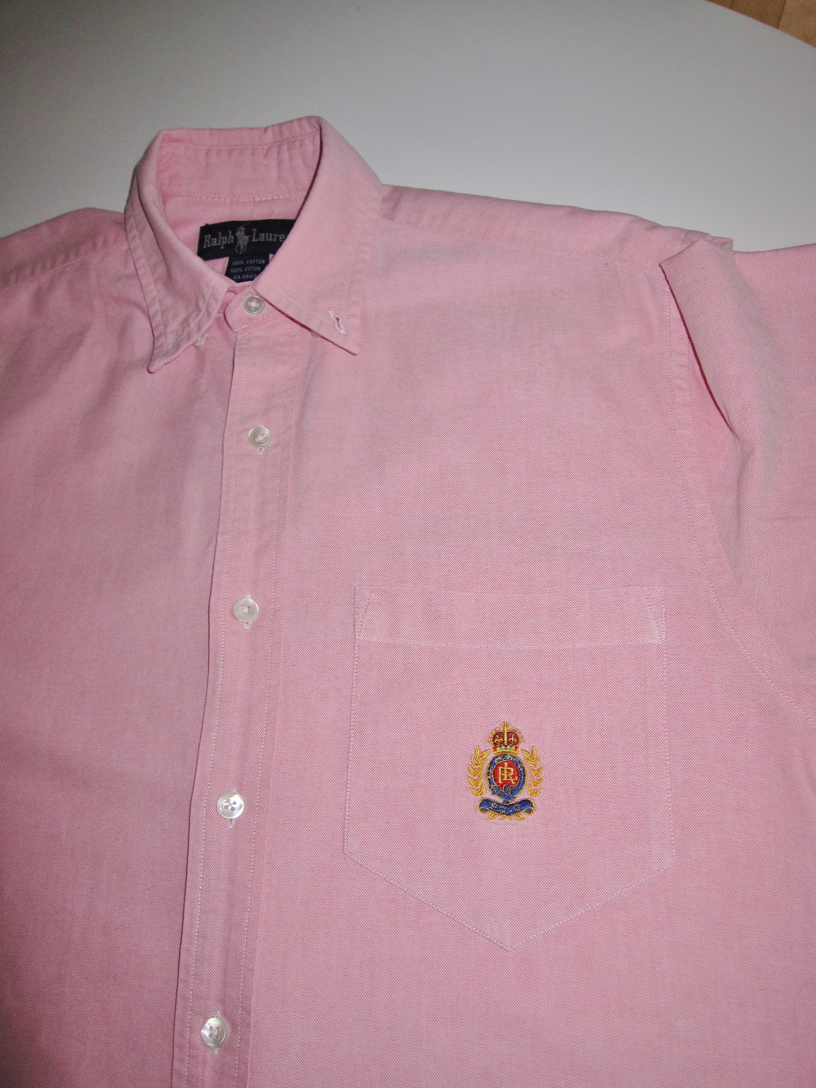
I started with this.  A Ralph Lauren oxford shirt that I decided my husband no longer needed!

Ralph Lauren shirt Ralph Lauren

And then with some black and white houndstooth check fabric I started to create.  Any guesses?

Ralph Lauren DIY pillow


A few cuts and stitches later this was the end product.  A Ralph Lauren oxford pillow!
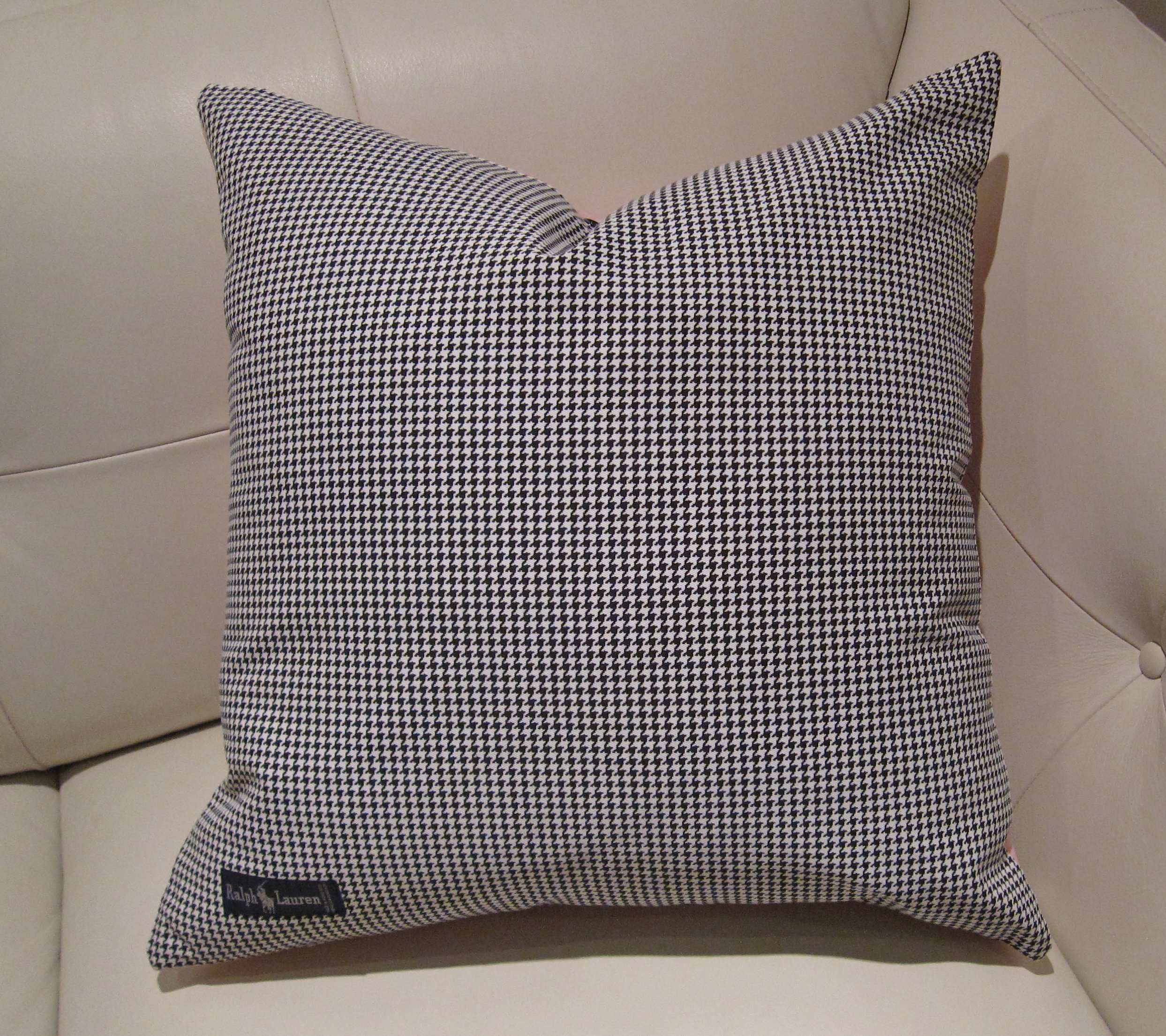
Ralph Lauren Pillow

Ralph Lauren houndstooth pillowRalph Lauren logoRalph Lauren label

The front of the pillow was the Ralph Lauren shirt complete with the pocket and logo plus I changed the white buttons to black for more interest.  The back of the pillow was the houndstooth with the Ralph Lauren label that I removed from the inside of the shirt at the neck and re-sewed on to the pillow.

A Modmissy creation now adorning a niece’s sofa!


A New Year

Today is the first day back to school which in our house really kick-starts the new year.

The holidays were wonderful.  I spent lots of quality time with family and had lots of fun with friends.  For me Christmas is always about spending time with those you love.

This past holiday I learned 2 things about myself.

  1.  While spending a lovely afternoon Christmas shopping with my niece, who is a beautiful (mature) young lady, I was referred to by a saleslady as her ‘mother’.  What I had envisioned as 2 females ‘out on the town’ having fun, swapping stories, trying on clothing together was now shattered.  I must not look as young as I feel!
  2. One of my cousins who faithfully read my blog told me that I had inspired her to re-decorate her living room.  She had decided one day as she walked into her living room that it was time for a ‘change’.  Encouraged by my blog she tackled the re-decoration of the room with confidence.  Bravo!

In life you win some, you lose some.  I am hoping that 2013 is a year of balance!

Inukshuk - balance

Image via Modmissy

PANTONE® Color of the Year 2013

Yesterday PANTONE® announced their Color of the Year for 2013.

A drum roll please……..

2013 Pantone Color of the Year - Emerald

“Lively. Radiant. Lush… A color of elegance and beauty that enhances our sense of well-being, balance and harmony.”       

As I look around my home I realize I do not have emerald in my décor although I do have an emerald coat (fabulous pop of colour in my way too black wardrobe!) and an emerald ring (birthstone for May).

The word ‘emerald’ is derived from the Greek word ‘smaragdus’, meaning green and as everyone knows that ‘being green’ these days is a very positive thing.  So I think as we venture into a new year Emerald will be a very optimistic and encouraging colour for 2013.

Now to embrace it in to my décor!

Emerald montage

Images via:  www.bakerfurniture.com www.jeffgoodmanstudio.com www.instyle-decor.com www.swanklighting.com

Pantone Color of the Year


Pantone’s Color of the Year 2013??

Pantone Color chairs

Every year at this time Pantone announces their ‘Color of the Year’.  Seen as the global authority on colour and provider of professional colour standards for the design industries, Pantone Inc. declares what they believe is the colour best suited to the upcoming year.  There is a philosophy in choosing this colour based upon world situations and influences of the period.

This year was Tangerine Tango, a lively orange and in 2011 it was Honeysuckle, an energetic pink.

Pantone Color of the Year

Interior designers, fashion designers, the automobile industry, the makeup industry and many other consumer product industries take notice of this ‘Color of the Year’ decision.

Pantone has influenced the shoe industry www.seavees.com

Pantone and Seavees shoes

Toothbrushes are even available in Pantone colours www.kikkerland.com

Pantone color toothbrushes

Makeup company Sephora www.sephora.com joined forces with Pantone to create colourful beauty products.

Sephora and Pantone

And these colourful stand mixers from KitchenAid www.kitchenaid.com are available every year in many new colours.  Influenced??

Kitchenaid Mixers

So if I had to wager a guess on what the 2013 Color of the Year might be I am thinking somewhere in the blue shade.

Stay tuned!


Grey is the New Black, Chanel No. 5

So have you heard? Brad Pitt is the new spokesperson for Chanel No. 5!!??

Chanel’s newly released TV commercial showcases the ‘world’s sexiest man’ explaining in a sexy and sensual voice, (as only Brad can),

I am not one to swoon over Hollywood stars and as I watched this TV commercial it wasn’t Brad I was observing.

Instead what I found interesting was the colour. Chanel has always been known for black. In fact Chanel invented the LBD – little black dress. In the 1950’s Marilyn Monroe ignited the celebrity of Chanel No. 5 when asked in an interview what she wore to bed, she revealed “five drops of Chanel No. 5”.


Since Marilyn Monroe’s endorsement of the fragrance there have been many beautiful and famous women who have been enlisted to represent Chanel No. 5.

In the 1970’s it was Catherine Deneuve who was the face of Chanel No. 5,

In this commercial Ms. Deneuve explains in her soft, sultry French voice,

In 2003 it was Nicole Kidman in a 2 minute commercial.

So often black has figured prominently in Chanel No. 5 advertising but in 2012 with the introduction of the first male as the voice of the fragrance, the sexiest-man-in-the-world Brad Pitt is awash in the colour grey – not black.

Similar to Benjamin Moore’s Nightfall 1596; “this dark, somewhat mysterious shade takes its colour cue from the stars’ dark, impenetrable backdrop”. Defines both the colour and the man!?


Fashion by Décor – When Inspiration Strikes!

Just wanted to share an outfit I wore for an evening out.  Constantly cruising the web looking at décor photos must have been the inspiration!

The boldly coloured living room appeared in Metropolitan Home (sadly now defunct) a number of years ago but is still quite fabulous.  I colour matched 3 Benjamin Moore paint colours from the photo and loved the combination.

Never know where inspiration strikes!


Donald “Duck” Dunn

Donald “Duck” Dunn, the legendary bass guitarist of Booker T. and the MG’s died this past weekend at the age of 70. Dunn was notable for his 1960’s recordings with Booker T and as a session bassist for Stax Records. It was Dunn’s bass lines recorded on many songs of the 1960’s that gave the world its ‘groove’; Otis Redding’s “Respect”, Sam and Dave’s “Hold On, I’m Comin’” and Albert King’s “Born Under a Bad Sign”. The influence of this ‘groovy’ music also had a large impact on fashion and décor of the 1960’s as you can see in these photos.

The popular Better Homes and Garden Decorating Ideas was the magazine of the time that captured home décor as seen in this 1960 issue.


Colour blocking and swirls were very popular for patterns of fabrics as seen in everything from furniture to clothing. The Rive Droite chair designed by Patrick Norguet covered in Pucci fabric.


Airline stewardesses circa 1960.

The lava lamp was invented in 1963.


‘Mid-Century Modern’ furniture was in full swing with Eames, Platner, and Panton to name a few creating the design classics of the 20th century.


This white Panton Chair designed in the 1960’s feels very similar to these ‘mod’ Go Go Boots designed by Clark Shoes in the 1960’s.


Fringes on lamp shades, doorway curtains and clothing were all the rage. Tie-dye, shag carpet, peace signs were signs of the times also. As we bid a final farewell to Donald “Duck” Dunn his legacy will live on forever in the music and the ‘groovy’ influences of that music that reverberated into décor and fashion.

BHG.com/Allmodern.com/Planetlava.com/Vitra.com/Candysays.co.uk


Art – Wherever, Whatever

Art.  A word that describes a diverse range of activities.  Visual art – painting, sculpture, photography, film etc.  Interactive art – music, theatre, dance, literature etc.  Sometimes it is the simplest things in life that is art.   Last year while shopping in NYC I saw this store display of all white mannequins dressed in all white clothing. (I don’t even remember what store; there were lots!)  It was the layering of white that the stylist had assembled with pops of colour which made me stop and admire.  Art – and it was not in one of the many NYC galleries either.   I took a photo and loved the result. Reminds me of a room with all the furniture slipcovered in white and the beautiful azure blue ocean just outside the window.

Photo #1 – Modmissy, Photo #2 Houzz.com

My Desire for Pink

This spring I have had a real desire to decorate with colour – especially pink.  I have never been a ‘pink’ person but I have been imagining my décor with hits of this bright hue.  It could be that the neutral colours of winter have me wanting anything but taupe, linen and grey.  I have been imagining how fun it would be to have something like this bright pink sofa from www.jamesstuartduncan.com and decorate a room around it with other hits of colours like juicy orange, sunshine yellow and chartreuse green.

So this past weekend I went shopping…..but for clothing/shoes/accessories.  Something I love to do!  A session of retail therapy always works wonders.  Of course a change of season is always a good excuse to go shopping too!  My subconscious mind must have been preprogrammed because the first thing that I found was a pink (actually raspberry) patent purse from www.badgleymischka.com.  I realized that my desire for colour had transferred over to my wardrobe.  It was way over my budget but I had to have it so I justified it by the fact that it cost a lot less than the pink sofa.

This purse became the ‘springboard’ for the shopping adventure that followed.  Those who know me will agree that generally I dress in black and white not bright colours so this shopping spree was a departure from the norm.  My eyes scanned the racks of clothing looking only for pinks, oranges, purples and chartreuses.

So this is what I came home with.

Whereas had I gone furniture shopping I would likely have come home with this – same colours, different pieces  Funny how that works!

Sofa and Chair: www.jonathanadler.com  Bouquet Chair: www.moroso.it    Lacquered Trays: www.westelm.com    Striped Pillow: www.roomandboard.com  Chartreuse Pillow:  www.westelm.com


Re-cycle, Re-Love

Many years ago I received a gift from my hubby of a black and white leather jacket.  It was one of those ‘team’ jackets where the body of the jacket is Melton wool and the sleeves are made of leather with an embroidered picture on the back.  The jacket was from the television series Street Legal, a Canadian production which aired from 1987 to 1994. 


I wore this jacket for the seven years of the shows airing but afterwards it was relegated to the cottage to be worn as a ‘campfire’ jacket.  This year after spring cleaning my closet I decided that the jacket had its time and it was goodbye.  I am a big believer of: if it isn’t being used enough, get rid of it.  I hate clutter and crowded closets. (that’s another post!)  But for some reason I could not seem to put that jacket in the bag with all the other items that were destined for the donation drop-off centre.  Throughout the summer the jacket got shuffled from one chair to another around the cottage.  I could not seem to part with this jacket for some reason, maybe it was memories.  Finally, I came up with another idea for re-purposing this jacket.  I took scissors to the jacket and cut and ripped it apart, I removed the Legal stitching from the embroidery picture and then had Queen monogrammed in its place.  It now read Queen Street which was appropriate as the scene was that of Queen Street in Toronto of which I live a stone’s throw away.  I then sewed the jacket into a cushion and it now adorns my sofa.  Very reduce, re-use and recycle and my original gift still lives on!


         Images via Modmissy