Grey is the New Black, Chanel No. 5

So have you heard? Brad Pitt is the new spokesperson for Chanel No. 5!!??

Chanel’s newly released TV commercial showcases the ‘world’s sexiest man’ explaining in a sexy and sensual voice, (as only Brad can),

I am not one to swoon over Hollywood stars and as I watched this TV commercial it wasn’t Brad I was observing.

Instead what I found interesting was the colour. Chanel has always been known for black. In fact Chanel invented the LBD – little black dress. In the 1950’s Marilyn Monroe ignited the celebrity of Chanel No. 5 when asked in an interview what she wore to bed, she revealed “five drops of Chanel No. 5”.


Since Marilyn Monroe’s endorsement of the fragrance there have been many beautiful and famous women who have been enlisted to represent Chanel No. 5.

In the 1970’s it was Catherine Deneuve who was the face of Chanel No. 5,

In this commercial Ms. Deneuve explains in her soft, sultry French voice,

In 2003 it was Nicole Kidman in a 2 minute commercial.

So often black has figured prominently in Chanel No. 5 advertising but in 2012 with the introduction of the first male as the voice of the fragrance, the sexiest-man-in-the-world Brad Pitt is awash in the colour grey – not black.

Similar to Benjamin Moore’s Nightfall 1596; “this dark, somewhat mysterious shade takes its colour cue from the stars’ dark, impenetrable backdrop”. Defines both the colour and the man!?


A Room with a View

Last week I wrote about the view from my kitchen window (see here); the inspirational changing of the view from season to season.  It is my ‘picture’ window to the world outside (or at least to my neighborhood).  Since writing that post many of you have shared with me stories about the view from your window and some even sent photos.

Imagine looking out your window and seeing this view as one reader does!!

Well today, I am going to visit that reader’s home to experience first-hand the view from that window.  This photo was taken last week while the fall colours were still in their heightened glory.  Beautiful.  And oh, by the way the reader lives on a houseboat!

So stay tuned…….more photos to come.


Black and Orange

I love the colour orange and I love the colour black but I personally try to avoid pairing them together in my décor.  When combined I associate these two colours as Halloween-like.  But in honour of today being Halloween I thought I would share some items that do exist [successfully] in black and orange.

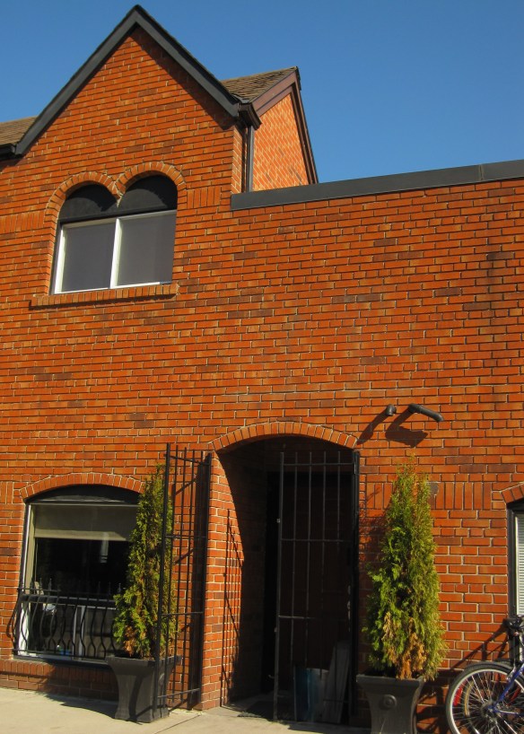
These terracotta coloured bricks appeared very orange in the bright afternoon sunlight combined with black wrought iron and trim work.

I saw this Enamel Vessel Pentad by Tom Dixon in a shop window.  Très décor!

The Magic Hole Chair designed by Philip Starck for Kartell.  Just a small pop of colour does make this black chair rather fun.

This contemporary coffee table designed by Jean Baptiste Sibertin Blanc is very mod!

This bathroom vanity definitely receives top marks for colour ingenuity!  Could you do it?

The Karlsson Mini Flip Wall Clock is something that I could set aside my no black/orange rule for.

Now wouldn’t this totally ‘decked out’ Porsche look great parked in front of my house!?
Hope you have a very fun-filled Halloween!

Fashion by Décor – When Inspiration Strikes!

Just wanted to share an outfit I wore for an evening out.  Constantly cruising the web looking at décor photos must have been the inspiration!

The boldly coloured living room appeared in Metropolitan Home (sadly now defunct) a number of years ago but is still quite fabulous.  I colour matched 3 Benjamin Moore paint colours from the photo and loved the combination.

Never know where inspiration strikes!


Fall Colours

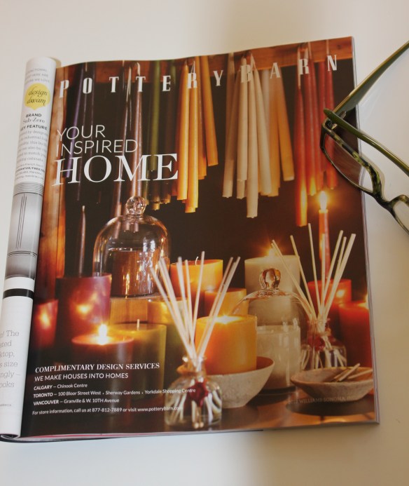
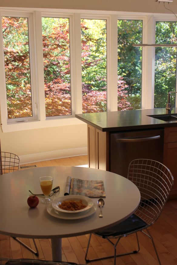
After everyone has headed off for the day I sit down and have my breakfast – my bowl of cereal.  This is my quiet time when I read a few pages from one of the décor magazines I subscribe to.  The other morning while reading I came across this advertisement that made me stop and think.

This Pottery Barn advertisement was a variety of candles in green, red and gold.  To me it was something that felt very 1980’s; specifically the colours of the 1980’s and early 1990’s.  Hunter green, burgundy and gold.  (The colour of our first master bedroom c. 1990!)   Very dated.   But when I happened to look up and notice the view out my kitchen windows I realized these colours are still very current.

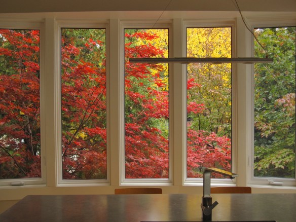
The outstanding colours of fall as the leaves turn into brilliant greens, reds and gold are never boring or dated.  They are inspirational.  The view from my kitchen window in the fall always amazes me and no matter how many times I walk into the room I am in awe.

When we originally renovated the kitchen it was about capturing the view, the colours, and the effect of nature.  I have almost no upper cabinets but the tradeoff is spectacular.

I also realized that hunter green, burgundy and gold is a colour scheme that will never get old just re-named – sage, cranberry and yellow (as I read a few pages further in the magazine).

Audrey Hepburn – Breakfast at Tiffany’s

It was over 50 years ago today, October 5th, 1961, that the much-loved movie, Breakfast at Tiffany’s was released.  One of the greatest female screen legends, Audrey Hepburn, played Holly Golightly, a young free-spirited New York socialite.

The first time I watched the movie I had thought (or hoped) that the beautiful Holly had it all; great fashion, big dreams, lots of friends.  The world was her oyster.  Not true.  By the end of the movie I had tears rolling down my face.

Audrey Hepburn made a lasting impression on generations of people and she still does in so many ways.

She endorsed the colour pink.

She showed us how softly painted pink walls can make one look beautiful.

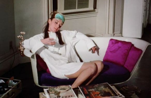
Audrey made ‘repurposed’ furniture look au-courant whilst lounging on her bathtub sofa in her NYC apartment in Breakfast at Tiffany’s.

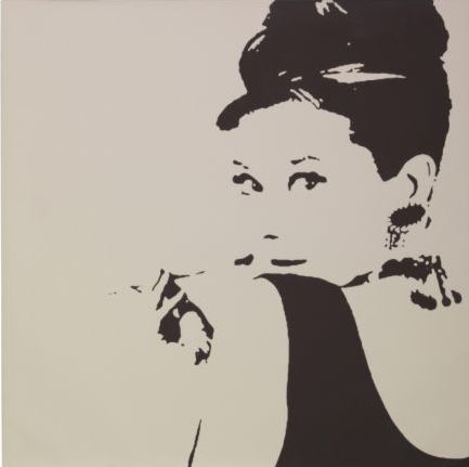
She has always been the perfect figure for pop-art,

And is the perfect silhouette for mega-giant IKEA to create PJÄTTERYD, a larger-than-life sized canvas of Audrey Hepburn, seen hanging in everything from hair salons to clothing shops and living rooms to dorm rooms.

We love you Audrey Hepburn.  Thanks for everything.

The legend lives on.


Niagara Falls

This past weekend I visited Niagara Falls, Canada.

The Horseshoe Falls dropping about 173 feet in distance and averaging 4 million cubic feet per minute of water crashing over the crest line provide an amazing spectacle of the power of water.

But while admiring the falls I find it hard to ignore the beautiful colour of the water.  The green colour is a byproduct of the ~60 tonnes/minute of dissolved salts and very finely ground rock produced by the erosive force of the Niagara River.  But I am thinking paint colour – Benjamin Moore Greenwood Lake 2037-50.  A fresh green that brings life to spaces, illuminating the room with pure, extraordinary colour.

Of course design takes inspiration from nature and fundamentally shapes how a person experiences the world.  One only has to take a look at the Waterfall Table and can predict what the designer’s inspiration possibly was.

Design is everywhere.  In life take time to smell the roses and notice their beautiful colour!

The Cottage Renovation – the after photos!

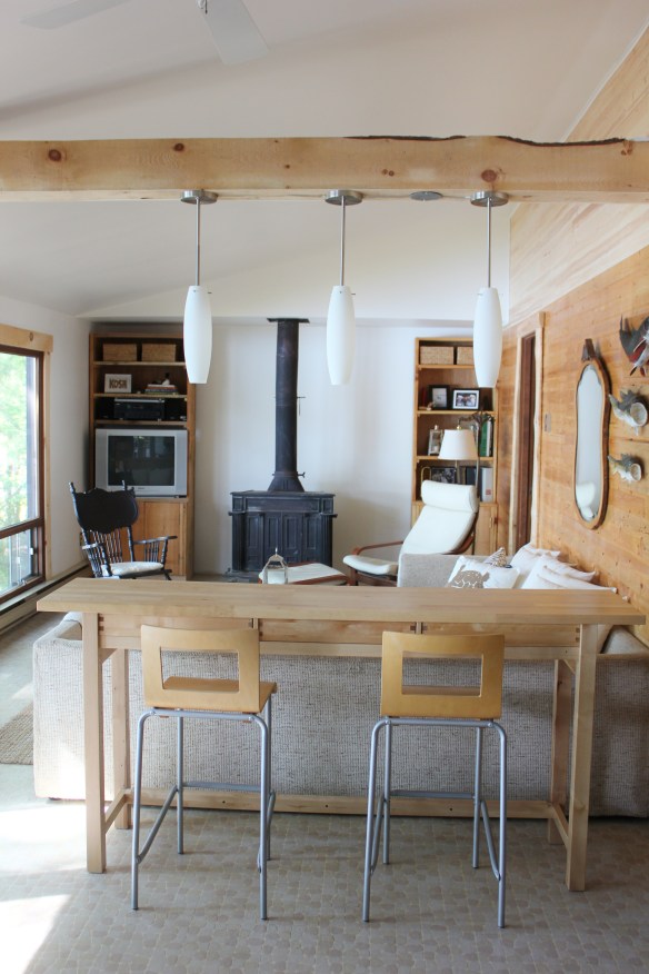
I started writing about our cottage renovation a few months back.  See start, gut, build, decor.  It was a renovation that took many months due to distance, weather and holidays.  But it is now complete.  Our initial goal was to raise the low ceiling but at the same time to create a cohesive relationship between the interior and exterior.  The cottage is truly about the nature and the ability to experience it.  In the end our renovation has given us more than just a new space.  The cottage’s clear lines and modernist approach has given us a greater appreciation of the amazing view beyond the large windows.  But more interestingly is the cohesive relationship now created within the family.   We spend more time together interacting as a family than ever before.  This is a space where we sit down together and share moments rather than racing through on the way to somewhere else.  We slow down and enjoy together.

Have a look.

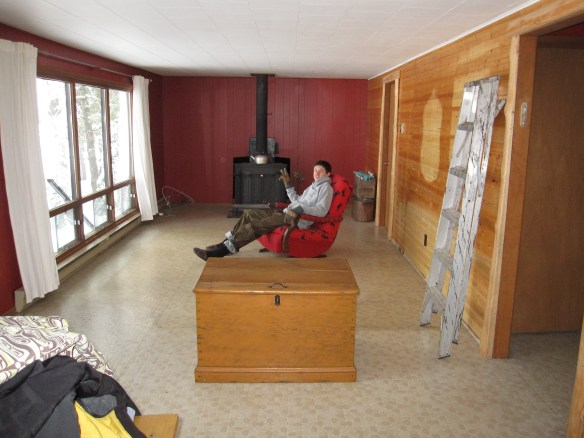
The before photo minus the furniture. (Just prior to gutting)

The After photos.

We forgo the upper cabinets opting for a larger window and a better view of the lake.  The wall above the stove is presently blank but waiting for the perfect piece of art that we have yet to find.

Counter space that we did not previously have is now a place for an ‘edible’ vignette.

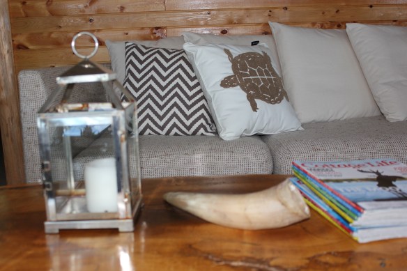
I chose neutral but fun pillows to keep the space calm.

We are thrilled with the outcome of this renovation and love all that this cottage now gives to us.

All images via Modmissy

Kitchen cabinets, Rug, Stools, Island, Leather Chair – IKEA http://www.ikea.com/

Hanging Light Fixtures – Home Depot http://www.homedepot.com/

Chevron Cushion – Nesters http://www.nestershome.com/

Turtle Pillow, Wooden Tiered Stand – HomeSense http://www.homesense.ca/


Ladies Lounge – after

A few weeks ago I wrote about my friend SW (SuperWoman) who was in the process of transforming her old wooden garage into a ‘ladies lounge’.

One year ago SW had decided that her garage could be better used as a backyard retreat rather than a storage space for ‘extra items’.

With a lot of love and elbow grease SW has achieved what she set out to do – she has turned a sow’s ear into a silk purse!

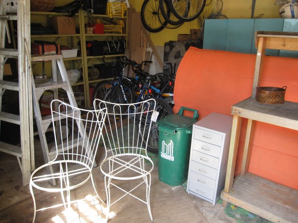
This was the ‘before’ photo with holes in the walls, old linoleum on the floor and lots of clutter:

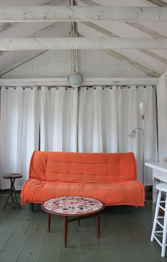
This is what SW’s efforts produced – the ‘after’ photo:

Bikes, tools, ladders and garden paraphernalia used to clutter the space.

Now everything is tucked away out of sight behind softly draping white curtains.

What was involved in the transformation?  The walls and ceiling were stripped back to the studs and sprayed a calming white.  An old brick fireplace chimney was removed.  The old linoleum was ripped up to reveal wood plank floors and then painted moss green.  Holes in the walls, floor and ceiling were repaired.  An old work bench was given a coat of white paint so that now it can be used as a bar and/or buffet table.  Furniture and accessories were brought in.  The orange futon provides the hit of colour in the room and a great place to take an afternoon nap.  The round teak table with inlaid mosaic top (a real score!) is a fabulous nod to mid-century modern not to mention a great surface for a game of Scrabble.  Any furniture that could was given a coat of white paint.  In the lofted ceiling a light that twinkles like the evening stars was wired in.

The lofted ceiling.

A pretty vignette.  And by the way, SW made most of the baskets in the space – yes she does basket weaving too!

So in her relentless pursuit of happiness, SuperWoman has moved mountains (and junk) to create a ‘getaway’ worthy of a super hero!!  Bravo SW.

All images via Modmissy


iYellow Wine Club at West Elm

Last night I attended iYellow Wine Club Presents+Design Series by Crush VQA Wines at West Elm.  Beautiful food was provided by Mildred’s Temple.  I sipped, noshed and strolled through West Elm – fabulous way to shop!

Believing that great design should be affordable, West Elm’s furniture collection helps create living spaces that are stylish and unique.  And while searching for inspiration in far-away places, West Elm offers accessories that have an artisanal and organic flair to them.  Since I am in the middle of a cottage reno my focus was on ‘cottage style’.  It was interesting to see how West Elm’s style could be interpreted  to a lakeside, seaside, weekend space.

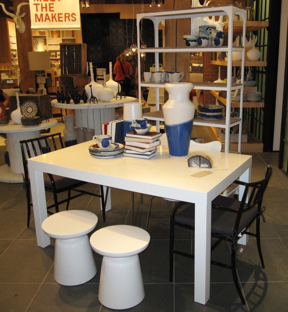
I thought this collection provided a contemporary spin on a nautical blue & white theme.

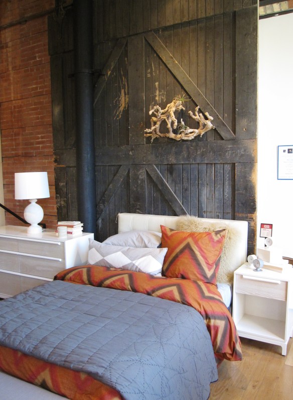
I loved this bedroom setting with the mix of barn board and contemporary furniture pieces with bedding in white, blue and cinnamon.

The organic blown glass pendant lights give an artisanal feel to any space.

White and muted pottery gives a relaxed vibe to a weekend space.

Red and white vases that have a resemblance to boat buoys and colourful pottery give an air of coastal charm.

Of course I found something that would be perfect in my cottage space so this weekend I shall add a little West Elm style to my lakeside retreat.

All images via Modmissy