Hermès Blanket – high vs. low

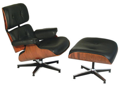
I am sure you have seen in many magazines the column titled High vs. Low.  Technology magazines, automotive magazines, home design magazines etc., etc. all have some sort of article written on product comparison based on cost.  Similar product, different price point.  Armed with this information readers can often make their purchases based on their individual budget.  In home design magazines I like the challenge of whether I can correctly determine which product is the high priced vs. which product is the low priced.  My stats are pretty good.  So I thought from time to time I would write about some high vs. low priced products.  My first items on the list are throw blankets.  Taking the title of ‘high priced’ is the Hermès Avalon blanket as seen under my ‘Modmissy Wish List’.  The Hermès signature ‘H’ blanket is made of 85% wool/15% cashmere and measures 55” X 69”.  It feels wonderful!!  And the price point?…….$1,225.00 U.S.!!  Ouch.  But when it comes to designer label throws Hermès does rule supreme.  You can always count on seeing this blanket draped over a sofa in any of the design magazines.  Although the cost of this blanket can cost as much as a sofa!  I have coveted this blanket for some time but it is not to be as budget rules for me.  Under the title of ‘low priced’ would be my own blanket, my Hermès substitute.   I thought it was a good substitute because it also has bold letters on it similar to the Hermes ‘H’.   It is a cotton/cashmere mix and measures 54” X 62”.  And the price point?…..under $100.  This blanket was more in my budget and I am persuading myself that it feels and looks just as good as the ‘high’ priced.  But it still remains on my wish list! 

   Hermes Avalon Blanket – High Priced


   My Blanket – Low Price


The Edible Focal Point

When it comes to food, presentation is about 75% of the taste.  If food looks good I believe it tastes better.  We eat with our eyes first; our eyes are our first senses that are stimulated.  Similarly in home décor, a room’s focal point is the first thing we see as we ‘taste’ the room.  The room’s focal point will draw the eye and hold it there giving the eyes a place to rest making the room feel more inviting.  A focal point may be an architectural feature such as a fireplace, built-in bookcase, a picture window or a detailed wall.  If the room has no distinguishing architectural feature the focal point may be a piece of art, a mirror, or a piece of furniture.  Sometimes a focal point can even be very small but if in the right location will immediately attract your eye.  A room’s focal point is key and no more than when staging a home do those words ring true.  I once had a client whose home I was staging for real estate sale where the house had been renovated top to bottom except for the kitchen.  The homeowner had run out of time and money but had decided to sell anyway.  My challenge was to make buyers overlook the fact that the kitchen was stuck in the early ‘80’s.  So working with what I had, I ‘diffused’ the situation by creating a focal point that potential buyer eyes were immediately drawn to.  On the kitchen counter I created a vignette of a black/white ‘barista’ centre complete with biscotti.  Knowing that the strong contrasting colours would draw the buyers’ eyes to this focal point first, the barista vignette of the coffee cup/cream and sugar/white linen/bowl of biscotti etc. offered a sense of ‘welcome’, a feeling of ‘retreat’.  My intent was to create a space that appealed to the buyers’ heart.  Well that bowl of biscotti did the trick, the un-renovated kitchen was overlooked and the house was sold.  The real estate agent told me afterwards that the buyer fell in love with the house when she walked in to the kitchen and visualized herself drinking her coffee in her new space.  A true story!  So if you are wondering where to start on decorating a room, start with the focal point. Below are some photos of another kitchen before/after photos.


        Images via Modmissy

Black Friday

Today is ‘Black Friday’….let the shopping begin!  Considered to be one of the biggest shopping days, Black Friday is the day following Thanksgiving Day in the United States.  Apparently the name originated in Philadelphia where it was used to describe the heavy and disorderly pedestrian and vehicle traffic that would occur on the day after Thanksgiving Day.  More recently the day is better known as the day that puts retailers ‘into the black’.  In honour of Black Friday I thought I would share a few of my favourite black items and some of my own black items. 

Black Leather Eames Lounge Chair and Ottoman

Jonathan Adler Black Sprout Vase

Black Slate Mongolian Lamb Pillow – West Elm

Black Wall Clock

My Black Wall Sconce

My Black Bertoia Chair

My Black Tizio Lamp


Horse Floor Lamp

A picture is worth a thousand words!  If I tried to explain to you in words what this item looked like I am not sure the true image would be conveyed.  Yes…that is a live sized black horse with a lampshade above its head!  While walking through the ELTE showroom  (located in Toronto) I spotted this absolutely stunning (read: very unique!) floor lamp.  It would have been hard to miss though as it stands at an impressive 7 feet tall and 7 ½ feet in length.  Not your average floor lamp!  Designed by the Swedish design group Front, whose work is based on explorations and experiments that communicate a story to the observer about the design process and the material used.  Sofia Lagerkvist, Charlotte von der Lancken and Anna Lindgren, the three members of Front, have in their work assigned part of the making of design to animals.  Just as this floor lamp is unique, so too would the space that could hold such a piece also have to be.  Considering the average house has doorway heights of 7 feet and ceiling heights of 8 feet, the Horse Floor Lamp would need a very ‘tall’ home!  And the price – almost $8,000.  That’s some serious pedigree!


                 Image via Modmissy


48 Years Ago Today

Today marks the 48th anniversary of the assassination of President John F. Kennedy.  Kennedy was fatally shot on Friday November 22, 1963 at 12:30pm, Central Standard Time, while travelling in a Presidential motorcade through Dallas, Texas.  The pursuing ten-month investigation by the Warren Commission concluded that the President was assassinated by Lee Harvey Oswald acting alone and Jack Ruby also acted alone when he killed Oswald before Oswald could stand trial.  These conclusions over the years have been considered ‘suspect’ to the American public.  Today as I read about what happened on that day 48 years ago it gave me goose bumps.  There were so many convoluted details pertaining to the assassination and theories as to what really did happen.  The who’s, the why’s, the where’s.  It made me think of the saying “Oh what a tangled web we weave when first we practice to deceive”.   On that note, weaving is a method of fabric production where two sets of yarns, the warp yarn and the weft yarn are interlaced at right angles to form a fabric.  The method in which the warp and weft are interwoven determines the type of fabric.  The three basic weaves are the plain weave, the twill weave and the satin weave.  Weaving was originally performed on a hand-loom but the Industrial Revolution brought about mechanized weaving.   And while on the subject of fabric, Jacqueline Kennedy, wife of J.F.K., became a fashion icon for her taste in clothing worn during her husband’s presidency.  The first lady was also known for the restoration of the White House interior which she thought was furnished with undistinguished pieces that lacked a sense of history.  The first Lady quoted, “I just feel that everything in the White House should be the best”.  On that note, may your ‘house’ always be at its best! 


Lilly Factory Towns

I recently came across this fabulous billboard advertising a new home development in Toronto’s east end.  I thought it was a wonderful departure from the typical billboard for new home developments showing an artist’s impression of lovely homes, mature trees and blue skies.  Nice enough, very typical but not head turning.  Or the classic billboard of a future development showing a happy couple in a big embrace with huge smiles on their face making me think that possibly this to be an advertisement for teeth whitening!  The Lilly Factory Towns sales centre billboard is a colourful and unique display of creative, outside-the-box thinking.  Sixty four colourful cups are lined up in the shape of a huge cup on a glossy black background.  Some of the lettering is also in bright pink.  Very fun and catchy; made my head turn.  The Lilly Factory Towns development has been named in tribute to the Lily-Tulip Cup Corporation factory that had stood on the property for many years.  The famous Lily paper cup was manufactured at the factory that became a well-known community landmark because of its huge two-story white cup marking the entrance into the building.  A definite head turner.  As a child whenever I saw this building I imagined it to be a place where cups of pop were handed out to anybody who knocked on the big white cup door!  Just as the huge white cup was distinctive so is the new billboard.  Which now makes me wonder, “Does each of the colourful cups hold a cold drink in them too?” 


            Image via Modmissy

Hanging for the Weekend


This is where I would like to hang for the weekend – no pun intended!  I came across this photo while doing some product search at RoomandBoard.com and liked the layout.  It was the 5 white pendant lamps hanging above the space that caught my attention.  The room’s ceilings must be quite high thus creating a space with possibilities for overhead drama. These sculptural lamps were designed by George Nelson in 1947 and became instant icons of mid-century modernism.  The lamps are constructed of a steel wire frame and covered with translucent plastic giving a nice soft light.  These lamps are part of the permanent collection of the MOMA (Museum of Modern Art) in New York City.  Also in this space I love the contrast of the white walls with the striated exotic wood floors that are left mostly uncovered to appreciate their true beauty.  The tall window with no surrounding trim or molding is quite contemporary in design and also allows for an unimpeded view to the outside greenery that lies beyond.  The full height white fireplace creates a striking focal point for the space.  The redefined ‘fire-scape’ with the natural river rock insert is a nice departure from the traditional log insert.  The hearth is both wrap-around and raised off the floor.  Nice details.  I love the dove grey velvet-looking sofa.  The sofa’s very clean lines go well with the contemporary feel of the space.  Completing the look is a Venatino marble-topped table and a natural fibre area carpet.  Actually completing the look would be me sitting on the sofa with a nice glass of wine and a great book!  Enjoy your weekend wherever you happen to be ‘hanging’.

Original or Not…you be the Judge.

Are any concepts or designs really truly original?  Or have they subconsciously been adapted from something previously seen or heard?  A design idea that was encouraged by something totally unrelated; a stimulus or an inspiration.   As Albert Szent-Gyorgyi, Hungarian biochemist, 1937 Nobel Prize for Medicine once said, “Discovery consists of looking at the same thing as everyone else and thinking something different.”  In the world of design there is the infamous title of designer inspired products called ‘knock-offs’.  Many of the design classics of the 20th century have been reproduced to mimic the same look.  Some pieces are almost exact duplicates – reproductions, some pieces are parallel-inspired from the original.  Whether you own an original or knock-off it almost always comes down to price.  Is one any more correct to own than the other…..that is a very subjective answer?  I own a number of original design classics but I also own some that are not.  When we renovated our media room I would have really liked to have an Eames Lounge Chair for the space but the $7000 price tag was a little prohibitive.  Subsequently I settled for an Eames Lounge Chair-inspired version which I love just as much and looks just as good.  An example of a knock off that many people may not even now about is the Series 7 Chair by Arne Jacobsen.  Originally designed in 1955 the curved plywood chair has been copied so many times that it has become commonplace.  In fact the other day when I was at the grocery store buying bread and milk I could have purchased a Series 7 Chair knock-off for $39.99 at the same time! 


The well-known IKEA classic Poäng chair (shown on the right) designed in 1976 looks very similar to the Alvar Aalto Lounge Chair 406 (shown on the left) designed in 1936.  You be the judge – is there really a right or a wrong??


Rock Inspiration

A friend of mine vacationed this past summer on Georgian Bay, Ontario with her family.  Each summer they tour around the lake in their boat and set up camp on one of the many 30,000 islands in Georgian Bay.  The marvel of the ‘sixth Great Lake’ is the beauty to behold in the windswept pines, the endless beaches, the majestic towering cliffs and the granite rock formations. The rugged beauty of the area inspired the artists of the Group of Seven to paint the Canadian landscape and thus started the first major Canadian national art movement.   Part of Georgian Bay sits on the southern edge of the Canadian Shield of granite bedrock exposed by glaciers at the end of the last ice age approximately 11,000 years ago.    While hiking across Beckwith Island my friend found a rock, probably granite that she immediately fell in love with and decided to carry it for the rest of the hike.  She even had to swim with the rock out to where the boat was anchored.  Although the rock was grapefruit-sized, it became very heavy to carry after a few hours.  But determined she was.  The rock made its way back to the city and took up residence on her fireplace mantle.  The colour of the rock, the sheen, the organic-ness of the rock became the inspiration for my friend’s living room makeover.  Each time there was a question or query as to what her direction or style was my friend looked to the rock.  In came a new deep grey sectional, a ‘greige’ shag area rug, and large matted, white framed prints for over the fireplace, new white drum shades on the black lamps, and a natural stone-topped cocktail table.  A white leather chair is on order and the hunt for a mid-century wood chair to place in front of the fireplace has begun.  The end wall in the dining room was painted in a deep grey as a stunning feature wall.  Accessories in silver and glass have been added also.  The room looks fabulous.  My friend is thrilled with her results.  And all this from a rock!