Floating Artist Studio

Continuing with yesterday’s post of living aboard a house boat I’ll now share with you a peek inside the owner’s floating artist studio.

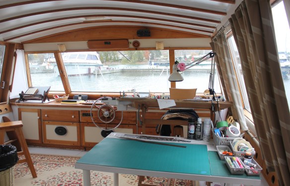
In a house boat that was built over 25 years ago and now lovingly restored by its new owner a fabulous artist studio and retreat awaits a short walk away.

Under a very mod curved ceiling and vintage inspired wood built-in cabinetry the owner has set up her drafting table, cutting table and all the other necessities required for her passion – drawing, sketching and painting.

Who wouldn’t be inspired with the view out of the wrap-around sloped windows?

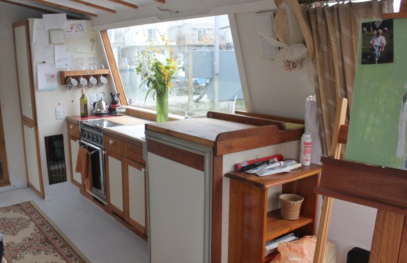
There is even a kitchen where snacks and refreshments are kept close to hand.

And I even had my sketch done!

Once again a big thank you to my host for sharing her home with me and all of you.

All images via Modmissy


Living Aboard a House Boat

I wanted to share a glimpse into the life of a Live-aboard or ‘LAB’ person.  Last week I visited the home of a reader who lives on a house boat.  Amazing!  Quietly nestled on the shore of Lake Ontario located minutes from downtown Toronto this home has it all.  It is a 2-storey with a 3rd floor deck, 2 bedrooms, 2 bathrooms, living room, entertaining-size dining room, deck off the living room, deck off the master bedroom, ample closets and storage space, central vac and a show stopper kitchen!!

Let me share.

The entrance driveway boasts a stellar view.

 

The neighbours,


And as I walked into this home I was greeted with the most unique, one-of-a-kind design detail.

A boat in a boat!
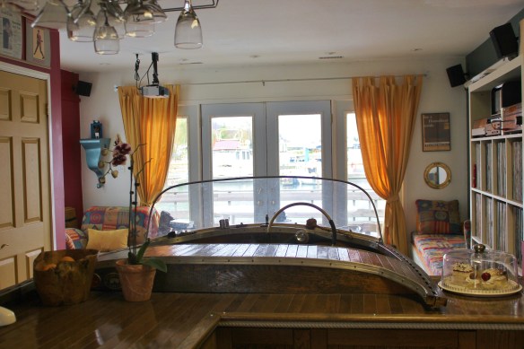


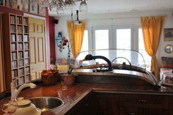
An old classic cedar strip boat had been converted into the kitchen island.  This boat, affectionately known as ‘Bob’ had been used for several years at the owner’s cottage but it was decided that it should be placed into permanent ‘dry-dock’ service.  So cool!


The kitchen cupboards and fridge were also clad in wood with hardware that mimicked hardware from a boat.


My kind host served a delicious lunch of salmon cakes (fittingly!) and we were joined by 2 other LAB neighbours.


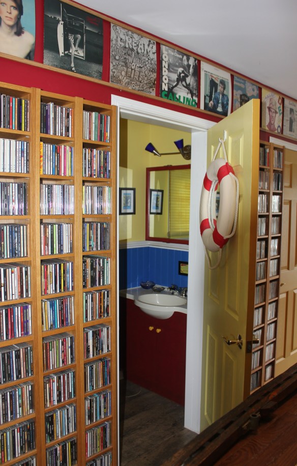
The owners are true audiophiles as evidenced by their large collection of CD’s and LP’s that were cleverly built-in to the house boats design.
 

In front of the large living room ‘port hole’ window was a convertible sofa that could be used in many different ways as items aboard always need to serve multi-use functions.  The owners hinted that there have been many fabulous ‘themed’ parties taken place here as the space is outfitted with a screen projector and movie nights take on a whole different scheme.  Think Martini Night with a classic James Bond movie and a boat.  Sounds fun!
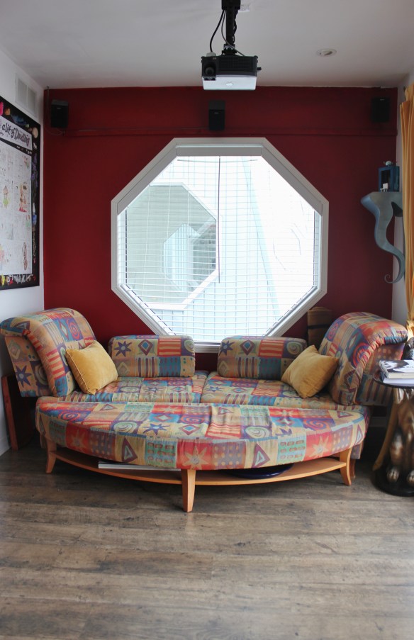
 

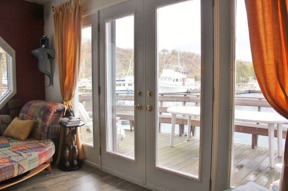
The walk-out from the living room to a waterside deck – and did not have to be reached with a 2 hour drive to the cottage.  How relaxing.
 

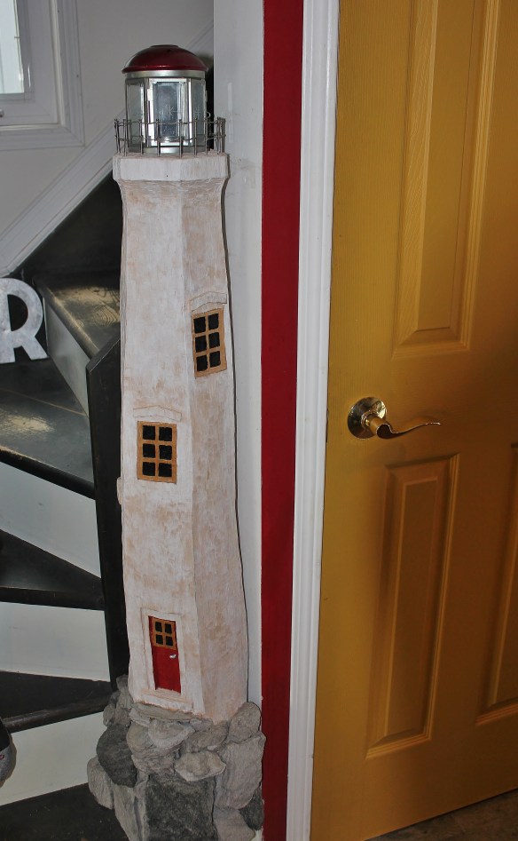
The newel post at the foot of the stairs leading up to the 2nd floor,
 

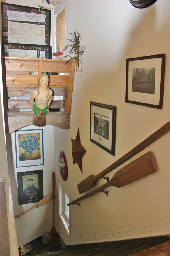
The stairwell is outfitted in all things nautical.
 

The walkout from the Master bedroom.
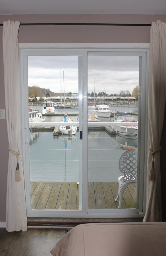
 

I also have photos of the floating Artist Studio where the owner gets her creative juices really flowing.  Stay tuned.

I want to extend a big thank you to my host for a fabulous afternoon aboard a house boat.

So…..what do you see from your window?

All images via Modmissy


In Remembrance

In the 1980’s I remember attending the opening celebration of Designers Walk www.designerswalk.com in Toronto.  The event promised to be an important affair in the design and architecture community as Designers Walk was to be Canada’s leading resource centre for interior design.

Of course an event as important as this required a new dress!  So off I went in pursuit of that perfect dress.

After much searching I found ‘the’ dress.  It was a light grey, soft and supple suede dress that was sewn in a chevron pattern.  Perfect for a design event – on trend colour, great texture, classic pattern.

The Designers Walk event was fabulous and the dress was a hit.  It was a thrill to be present for this landmark occasion.

But the lasting memory I have of this whole affair that to this day still resonates with me is the person I met who sold me the dress.

I was in a dress shop and having a difficult time making any decision and getting frustrated trying to zip and un-zip in the change room when a very kind saleslady approached me offering assistance.  She patiently zipped and un-zipped for me.  It was when I finally tried on the grey suede dress that the saleslady rolled up her sleeves, put her hands on her hips and announced that this was ‘the’ dress.   I suddenly froze.  There on the saleslady exposed forearm was a tattoo.  A number tattoo.  During World War II the system of identifying prisoners at the Auschwitz Concentration Camp was to tattoo numbers on to their skin.  People were not identified by their face or their name but rather a number indelibly stamped on their body.  OMG was all I could think as I stood there trying not to stare at the saleslady’s forearm.  She had been at Auschwitz and had survived.  She had been witness to horrific events.  I have never forgotten this kind, patient lady.

In remembrance to all those who have lost their lives or have been witness to terrible violence during war and fighting I acknowledge their great courage and sacrifice.

Lest we forget.

Grey is the New Black, Chanel No. 5

So have you heard? Brad Pitt is the new spokesperson for Chanel No. 5!!??

Chanel’s newly released TV commercial showcases the ‘world’s sexiest man’ explaining in a sexy and sensual voice, (as only Brad can),

I am not one to swoon over Hollywood stars and as I watched this TV commercial it wasn’t Brad I was observing.

Instead what I found interesting was the colour. Chanel has always been known for black. In fact Chanel invented the LBD – little black dress. In the 1950’s Marilyn Monroe ignited the celebrity of Chanel No. 5 when asked in an interview what she wore to bed, she revealed “five drops of Chanel No. 5”.


Since Marilyn Monroe’s endorsement of the fragrance there have been many beautiful and famous women who have been enlisted to represent Chanel No. 5.

In the 1970’s it was Catherine Deneuve who was the face of Chanel No. 5,

In this commercial Ms. Deneuve explains in her soft, sultry French voice,

In 2003 it was Nicole Kidman in a 2 minute commercial.

So often black has figured prominently in Chanel No. 5 advertising but in 2012 with the introduction of the first male as the voice of the fragrance, the sexiest-man-in-the-world Brad Pitt is awash in the colour grey – not black.

Similar to Benjamin Moore’s Nightfall 1596; “this dark, somewhat mysterious shade takes its colour cue from the stars’ dark, impenetrable backdrop”. Defines both the colour and the man!?


Daylight Savings – Time in Design

This coming Sunday is Daylight Savings Time when we turn back the clocks an hour.  One extra hour added to the weekend – amazing!  In honour of that bonus hour I thought I would share some clocks that show design in time.

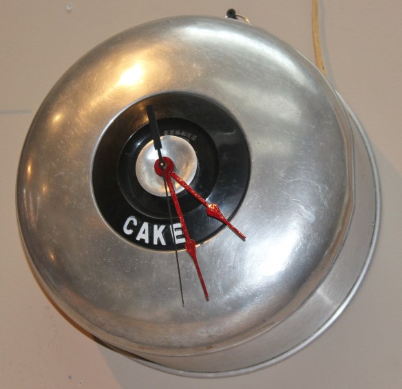
This clock I found on www.houzz.com

The 5-Foot French Tower Clock from Restoration Hardware is a classic reproduction that actually doesn’t keep time but does make a ‘timeless’ statement!  www.restorationhardware.com

I photographed this artisan clock at Biltmore Domicile www.bdom.ca  located in the Distillery District.

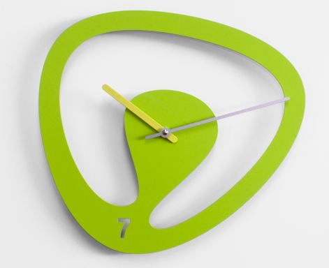
Seven by Karim Rashid wall clock in brightly painted steel.  Leave it to Karim to alter the standard form – 7 is the new 6!

6 Libero designed by Riccardo Paolino and Matteo Fusi.  Made of wood and stainless steel, the 6 has escaped by bending the bars of the prison.  Don’t just turn back time, take it back!

RND Time designed by RND Lab.  Small cubes may be assembled randomly on the wall. These white cubes pop against this chartreuse wall colour.  Fun!

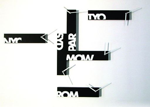
Souvenir 6 designed by Alberto Sala.  Keep time in 6 international cities – perfect for the jet setter.

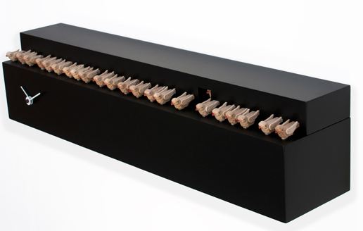
Fatti + in là designed by Studio Kuadra.  Telling time while keeping all your birds in a row makes this cuckoo clock an adventure in time.

The designers’ inspiration for the Fatti + in là!!

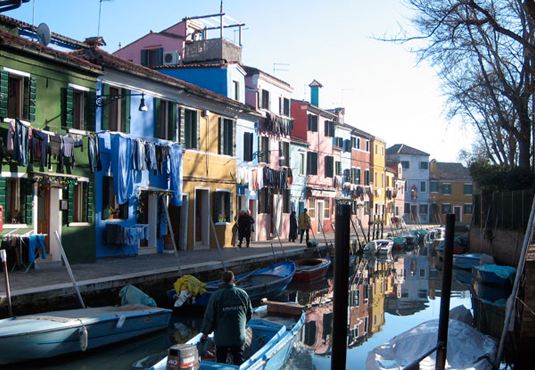
Burano designed by Eloisa Libera is a cuckoo clock that is reminiscent of the houses of the famous Burano Island in Venice Lagoon.

Burano Island in Venice Lagoon – the designer’s inspiration

So tic toc pick a clock which one would you choose?

Whatever way you keep time in your life have a great weekend and if you are observing Daylight Savings enjoy your extra hour.

Images 4-11 via www.progettishop.it

A Room with a View

Last week I wrote about the view from my kitchen window (see here); the inspirational changing of the view from season to season.  It is my ‘picture’ window to the world outside (or at least to my neighborhood).  Since writing that post many of you have shared with me stories about the view from your window and some even sent photos.

Imagine looking out your window and seeing this view as one reader does!!

Well today, I am going to visit that reader’s home to experience first-hand the view from that window.  This photo was taken last week while the fall colours were still in their heightened glory.  Beautiful.  And oh, by the way the reader lives on a houseboat!

So stay tuned…….more photos to come.


Black and Orange

I love the colour orange and I love the colour black but I personally try to avoid pairing them together in my décor.  When combined I associate these two colours as Halloween-like.  But in honour of today being Halloween I thought I would share some items that do exist [successfully] in black and orange.

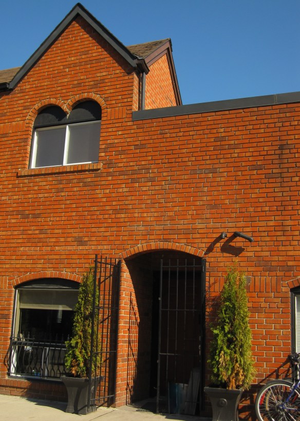
These terracotta coloured bricks appeared very orange in the bright afternoon sunlight combined with black wrought iron and trim work.

I saw this Enamel Vessel Pentad by Tom Dixon in a shop window.  Très décor!

The Magic Hole Chair designed by Philip Starck for Kartell.  Just a small pop of colour does make this black chair rather fun.

This contemporary coffee table designed by Jean Baptiste Sibertin Blanc is very mod!

This bathroom vanity definitely receives top marks for colour ingenuity!  Could you do it?

The Karlsson Mini Flip Wall Clock is something that I could set aside my no black/orange rule for.

Now wouldn’t this totally ‘decked out’ Porsche look great parked in front of my house!?

Hope you have a very fun-filled Halloween!

Fashion by Décor – When Inspiration Strikes!

Just wanted to share an outfit I wore for an evening out.  Constantly cruising the web looking at décor photos must have been the inspiration!

The boldly coloured living room appeared in Metropolitan Home (sadly now defunct) a number of years ago but is still quite fabulous.  I colour matched 3 Benjamin Moore paint colours from the photo and loved the combination.
Never know where inspiration strikes!


Queen’s University

My son is in his final year of high school and now faced with the task of choosing a university to attend next year.  Selecting a university by program is important but I have come to realize that the ‘feel’ of the campus ranks very high too.  So we have been visiting campuses every weekend.  Recently our travels took us to Queen’s University in Kingston, Ontario.

Walking around the campus gives the best overview.

My niece (a Queen’s student) was our tour guide. Thanks Jen

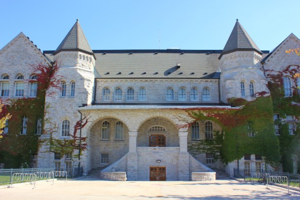
Founded in 1841, Queen’s has a lot of historical presence.  Most buildings including all constructed before the 1960’s are faced with limestone giving many of Queen’s buildings a castle-like appearance.

Ban Righ Hall, opened in 1925, is the first student residence on the Queen’s campus that also provided dining facilities.  The historical dining hall could have been the inspiration for Dickens Oliver Twist, “Please sir, I want some more”.  Outside the dining hall’s large windows was terrace seating perfect for eating on a sunny day.

Goodes Hall, a 110 year-old Victorian schoolhouse, has been preserved into the Queen’s School of Business.

Blending the old with the new Goodes Hall recently expanded combining the history of the 1892 schoolhouse with the contemporary design of a 75,000 sq. ft. wing addition.

Much of the old architecture in Goodes Hall was maintained such as the grand maple staircase, maple wainscoting and tin ceilings.  Once again I felt like I was walking into an old movie set.

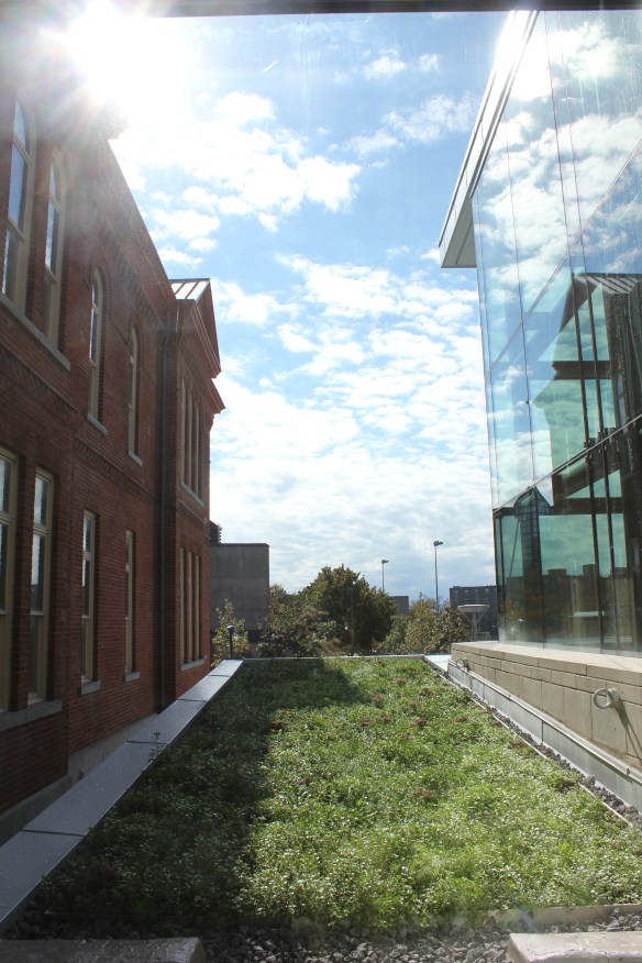
The old and new architecture blend together quite beautifully.

A ‘green’ roof bridging the two buildings together is very cool.  (pun intended!)

And to top it all off Queen’s University sits right on the shore of Lake Ontario so we finished our tour with a picnic lunch on the beach.  What’s not to love about a university on the beach!?

All images via Modmissy

Fall Colours

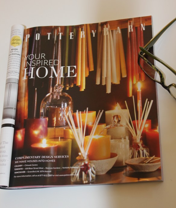
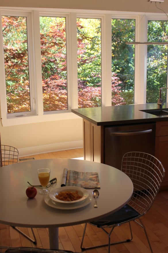
After everyone has headed off for the day I sit down and have my breakfast – my bowl of cereal.  This is my quiet time when I read a few pages from one of the décor magazines I subscribe to.  The other morning while reading I came across this advertisement that made me stop and think.

This Pottery Barn advertisement was a variety of candles in green, red and gold.  To me it was something that felt very 1980’s; specifically the colours of the 1980’s and early 1990’s.  Hunter green, burgundy and gold.  (The colour of our first master bedroom c. 1990!)   Very dated.   But when I happened to look up and notice the view out my kitchen windows I realized these colours are still very current.

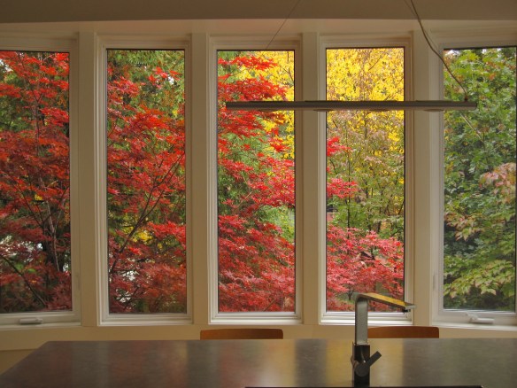
The outstanding colours of fall as the leaves turn into brilliant greens, reds and gold are never boring or dated.  They are inspirational.  The view from my kitchen window in the fall always amazes me and no matter how many times I walk into the room I am in awe.

When we originally renovated the kitchen it was about capturing the view, the colours, and the effect of nature.  I have almost no upper cabinets but the tradeoff is spectacular.

I also realized that hunter green, burgundy and gold is a colour scheme that will never get old just re-named – sage, cranberry and yellow (as I read a few pages further in the magazine).