A Room with a View

Last week I wrote about the view from my kitchen window (see here); the inspirational changing of the view from season to season.  It is my ‘picture’ window to the world outside (or at least to my neighborhood).  Since writing that post many of you have shared with me stories about the view from your window and some even sent photos.

Imagine looking out your window and seeing this view as one reader does!!

Well today, I am going to visit that reader’s home to experience first-hand the view from that window.  This photo was taken last week while the fall colours were still in their heightened glory.  Beautiful.  And oh, by the way the reader lives on a houseboat!

So stay tuned…….more photos to come.


Black and Orange

I love the colour orange and I love the colour black but I personally try to avoid pairing them together in my décor.  When combined I associate these two colours as Halloween-like.  But in honour of today being Halloween I thought I would share some items that do exist [successfully] in black and orange.

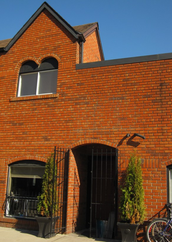
These terracotta coloured bricks appeared very orange in the bright afternoon sunlight combined with black wrought iron and trim work.

I saw this Enamel Vessel Pentad by Tom Dixon in a shop window.  Très décor!

The Magic Hole Chair designed by Philip Starck for Kartell.  Just a small pop of colour does make this black chair rather fun.

This contemporary coffee table designed by Jean Baptiste Sibertin Blanc is very mod!

This bathroom vanity definitely receives top marks for colour ingenuity!  Could you do it?

The Karlsson Mini Flip Wall Clock is something that I could set aside my no black/orange rule for.

Now wouldn’t this totally ‘decked out’ Porsche look great parked in front of my house!?

Hope you have a very fun-filled Halloween!

Fashion by Décor – When Inspiration Strikes!

Just wanted to share an outfit I wore for an evening out.  Constantly cruising the web looking at décor photos must have been the inspiration!

The boldly coloured living room appeared in Metropolitan Home (sadly now defunct) a number of years ago but is still quite fabulous.  I colour matched 3 Benjamin Moore paint colours from the photo and loved the combination.

Never know where inspiration strikes!


Fall Colours

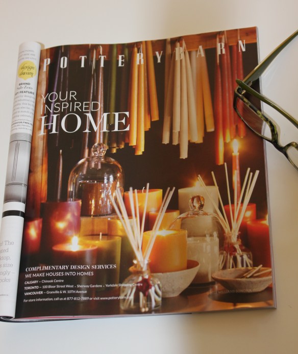
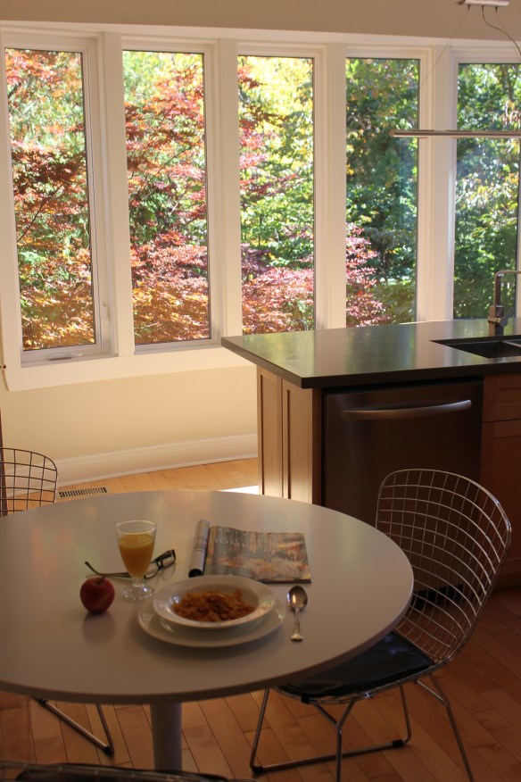
After everyone has headed off for the day I sit down and have my breakfast – my bowl of cereal.  This is my quiet time when I read a few pages from one of the décor magazines I subscribe to.  The other morning while reading I came across this advertisement that made me stop and think.

This Pottery Barn advertisement was a variety of candles in green, red and gold.  To me it was something that felt very 1980’s; specifically the colours of the 1980’s and early 1990’s.  Hunter green, burgundy and gold.  (The colour of our first master bedroom c. 1990!)   Very dated.   But when I happened to look up and notice the view out my kitchen windows I realized these colours are still very current.

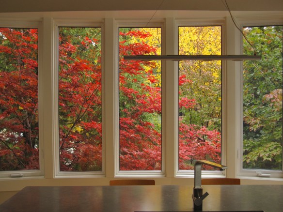
The outstanding colours of fall as the leaves turn into brilliant greens, reds and gold are never boring or dated.  They are inspirational.  The view from my kitchen window in the fall always amazes me and no matter how many times I walk into the room I am in awe.

When we originally renovated the kitchen it was about capturing the view, the colours, and the effect of nature.  I have almost no upper cabinets but the tradeoff is spectacular.

I also realized that hunter green, burgundy and gold is a colour scheme that will never get old just re-named – sage, cranberry and yellow (as I read a few pages further in the magazine).

Creamy and Dreamy

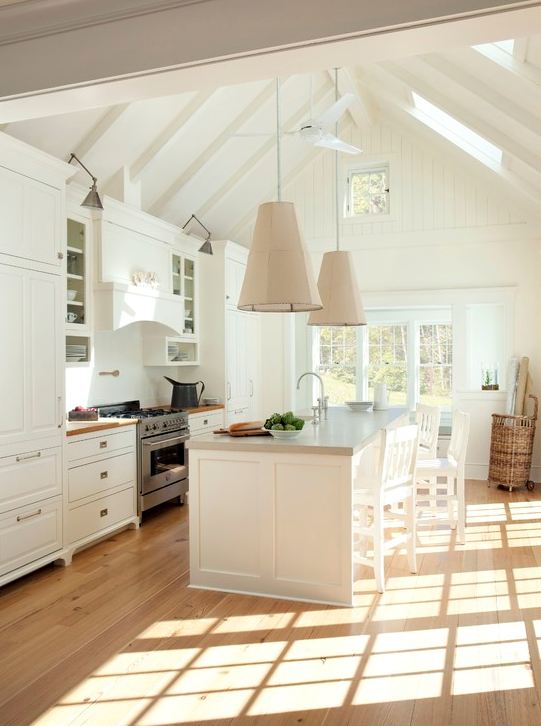
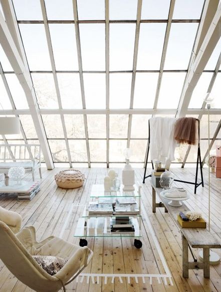
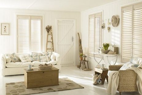
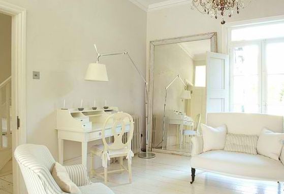
My computer’s desktop background presently is a photo of my cottage which I will not be visiting until next spring.  But the photo keeps me inspired.  So in honour of sun-drenched spaces I thought I would close out the week with spaces that I call Creamy and Dreamy.

This sun-drenched kitchen would make any chef happy.

An outstanding expanse of windows would certainly create a light filled space.

This photo has a very calming feel – almost dream like.

Love the mix of styles, painted floor and creaminess of this space.

Ikea’s sun-drenched room Scandinavian style.

And of course my cottage.

Have a great weekend.

Images via Houzz.com, Canadian House and Home, Ikea, Modmissy

How to Steal a Million

Yesterday, Rotterdam’s Kunsthal Museum experienced its worst nightmare – stolen art!  In the wee hours of the morning thieves made off with 7 paintings by master artists.  Included in the heist were:

  • Monet’s 1901 Waterloo Bridge, London and Charing Cross Bridge, London.
  • Henri Matisse’s 1919 Reading Girl in White and Yellow
  • Paul Gauguin’s 1898 Girl in Front of Open Window
  • Picasso’s 1971 Harlequin Head.
  • Meyer de Haan’s Self-Portrait
  • Lucian Freud’s 2002 work Woman with Eyes Closed.

Truly a terrible situation as the art was from a private collection and generously loaned to be on display for the public’s viewing.

Curious as to how the thieves could pull off such a feat in today’s world of technology and hi-tech security it made me wonder ‘how does one steal a million’?  How did Audrey Hepburn and Peter O’Toole do it in the 1966 movie How to Steal a Million?  A romantic comedy about a woman who must steal a statue from a Paris museum to help conceal her father’s art forgeries, and the man who helps her.

If you have never watched How to Steal a Million you must.  The fashions, cars and set designs are well worth seeing.

The movie is set in France so there is great architecture to be seen.

The sweeping staircase and Baroque furniture in the home Audrey shares with her father is beautiful.

Notice the bed linens, upholstered head-board and wallpaper are all the same pattern in Audrey’s bedroom.

The curving banquette that Audrey perches upon while wearing her infamous lace mask is so fabulous.  Possibly velvet.

Of course there is lots of art to be seen.

And here is something interesting that I noticed.  Audrey Hepburn sitting at her dressing table in How to Steal a Million and looking rather pensive has an uncanny likeness to Henri Matisse’s Reading Girl in White and Yellow also looking rather pensive.

I wish all the best to the Kunsthal Museum in retrieving the stolen art.


Coat Hooks

No doubt autumn is here; I awoke this morning to frost on rooftops, cars and my garden!  Sadly (for me) it’s time to pull out the warmer coats.  Now where to hang them?

Thought I would share with you some interesting variations of the coat hook.

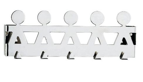
First up is the Girotondo Coat Rack by Alessi.  I like the polished chrome.

The Kartell hook made of polycarbonate is available in 4 vivid hues and solid black and white.

The classic Hang It All Coat Rack by Ray and Charles Eames never disappoints.

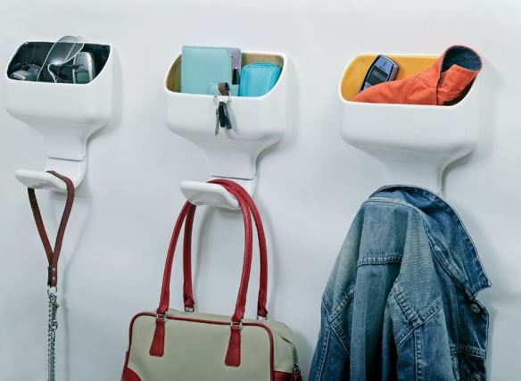
The Hook Box by Luca Nichetto designed to not only hold a coat but solves the problem of where to put your ‘stuff’.

Another hook that solves the problem of where to put your ‘stuff’, the Cubby coat hook designed by Materious.

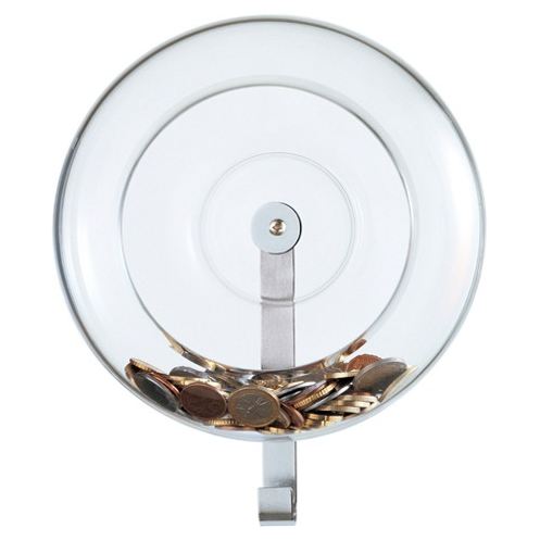
The FontanaArte Holder is made from blown transparent glass that provides a spot for bus fare or the dog leash.

The Tabard designed by Denis Santachiara is fitted with 6 hooks on the inside and a lamp to light your clothing.  Generally coat hooks are covered by clothes, whereas the Tabard covers the clothes protecting them from dust.

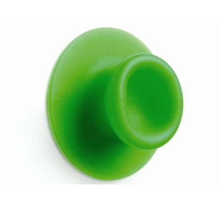
The Droog Sucker designed by Jan Hoekstra and Leon Ramakers solves the problem of having to drill holes into the walls by ‘sucking’ onto a smooth surface.  And it’s available in 6 different fun colours.

The Quote Hooks by Blend give gentle reminders each day.

Which one would you choose?


Iris and Emmie

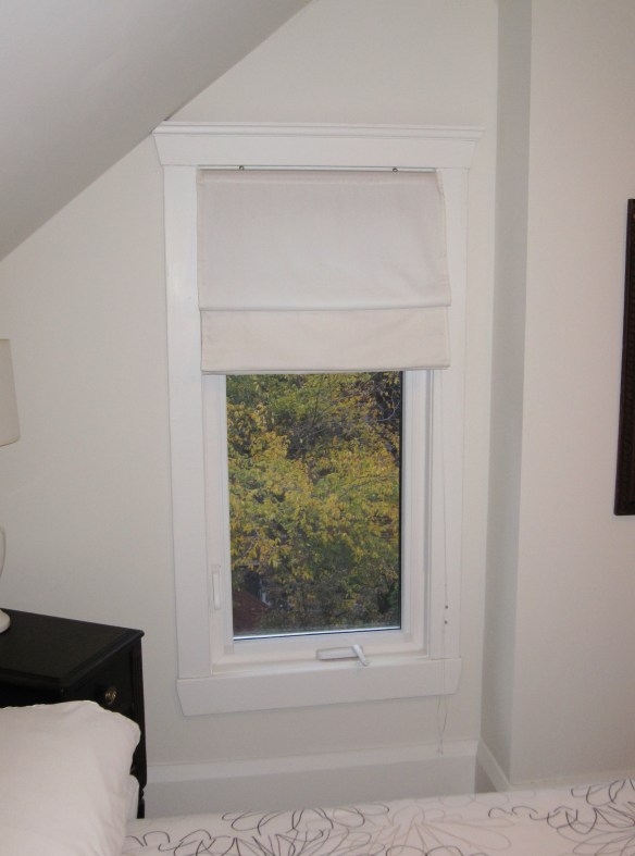
Every Home Stager has their tricks of the trade; the ‘go-to’ items that are used when getting a home ready for sale.  One such item I often purchase for staging was the Iris Roman Blind by IKEA.  This simple to install and very affordable (~$7) white cotton blind was the perfect solution to dress up a bathroom or even a small kitchen window.  Unfortunately IKEA discontinued the blind (safety issues) and just when I wanted one for my own home too.  Darn!

But here’s an interesting story.  One day I pull up to the car wash and while waiting for my turn in line I decide to tidy up the inside of my car.  Just as I am about to throw my garbage into the pail provided for customers guess what I see standing up in the garbage pail? An IKEA Iris Roman Blind still in the package.  Brand new never been used and exactly the size I was looking for!!  What are the chances?

But goods news, IKEA now sells a blind similar to the Iris – the Emmie.  (Must be the sister version!) This blind is also a good-looking, affordable solution for a window.

I like the tailored crispness of this blind and can see it hanging in a bathroom, nursery, kitchen, cottage or wherever.

Check it out.  http://www.ikea.com/ca/en/catalog/products/30219016/

One Small Step for Mankind

Green.  Green is the colour that symbolizes nature and the natural world.  It is the colour of balance and life.  And being green is to be thinking of the earth in sustainable and healthy ways.  We have not inherited this land from our fathers; rather we borrow this land from our children.  It’s about everyone doing their part.  Less impact on the earth; reduce, reuse, recycle.

I want to give a big ‘shout out’ to Keilhauer, www.keilhauer.com a furniture manufacture who I have previously written about (see here).  Part of Keilhauer’s mission statement is their sustainability program called ‘Planet Keilhauer’ – to create a company that is environmentally benign and socially progressive.  Their ‘Big-Time Corporate Goal’ is closed loop manufacturing – a sustainable system in which a product is created using renewable energy, with no pollutant output and no waste, the materials used in production are recycled and reused rather than discarded.

Wouldn’t it be great if all manufactures thought of this?!!

Well guess what?  Keilhauer has achieved their mission statement goal.  Their products are now LEVEL® certified.  LEVEL® is the sustainability certification program for the furniture industry that was created to provide the most open and transparent means of evaluating and communicating the environmental and social impacts of furniture products in the built environment.

A family owned company that started in 1981 manufacturing custom furniture for the local market Keilhauer products are now sold world-wide.  Since its inception Keilhauer’s values stressed respect and integrity for its people and its customers.  Today that includes people and the planet.

Bravo!