Opposites Attract

On this day, November 16th 1959, The Sound of Music opened on Broadway and on November 16th 2001, the first Harry Potter movie opened.  Both were blockbusters.

Set in 2 completely different eras, one in the mid-20th century and the other in the 21st century.  Maria is governess to 7 children of a widower and Harry is an orphan.  Maria flies around the countryside singing to the mountains, while Harry flies on a broomstick.  If The Sound of Music were to open in theatres today we might find it dated and if Harry Potter had been viewed in the 1950’s it might have been too modern.  Yet Maria finds magic through the sound of music and Harry finds magic through wizardry.

Opposites attract.

Mixing of eras, mixing of styles.  But a connection exists.

And thus in décor the same happens.  The juxtaposition of modern with antique, contemporary with vintage, in some way there is a wonderful partnership.  Pieces that blend and contrast at the same time give interest to a room.

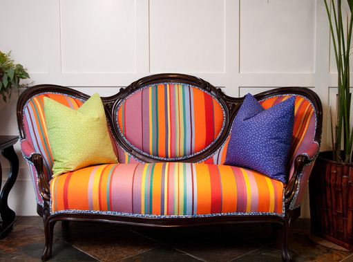
A modern fabric will ‘pop’ new life onto an antique settee.

The warmth of the wood of this antique desk pairs well with a modern chair producing an office space that makes one reflect.

The mixture of chairs all within the same colour palette combined with modern abstract paintings and an antique sideboard creates a cohesive dining room.

I love the mix of ornate old character and clean modern pieces in a contemporary white space.

The boldly patterned wallpaper provides the perfect background for mixing of styles in this entryway.

Whatever your style, whatever your preference – mix it up and create your own ‘blockbuster’.

All decor images via houzz.com

Grey is the New Black, Chanel No. 5

So have you heard? Brad Pitt is the new spokesperson for Chanel No. 5!!??

Chanel’s newly released TV commercial showcases the ‘world’s sexiest man’ explaining in a sexy and sensual voice, (as only Brad can),

I am not one to swoon over Hollywood stars and as I watched this TV commercial it wasn’t Brad I was observing.

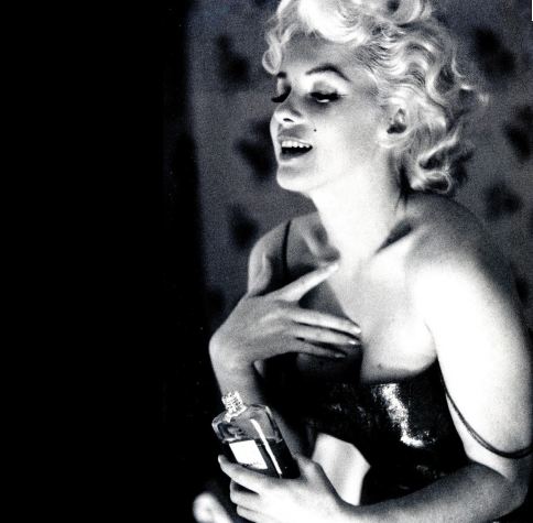
Instead what I found interesting was the colour. Chanel has always been known for black. In fact Chanel invented the LBD – little black dress. In the 1950’s Marilyn Monroe ignited the celebrity of Chanel No. 5 when asked in an interview what she wore to bed, she revealed “five drops of Chanel No. 5”.


Since Marilyn Monroe’s endorsement of the fragrance there have been many beautiful and famous women who have been enlisted to represent Chanel No. 5.

In the 1970’s it was Catherine Deneuve who was the face of Chanel No. 5,

In this commercial Ms. Deneuve explains in her soft, sultry French voice,

In 2003 it was Nicole Kidman in a 2 minute commercial.

So often black has figured prominently in Chanel No. 5 advertising but in 2012 with the introduction of the first male as the voice of the fragrance, the sexiest-man-in-the-world Brad Pitt is awash in the colour grey – not black.

Similar to Benjamin Moore’s Nightfall 1596; “this dark, somewhat mysterious shade takes its colour cue from the stars’ dark, impenetrable backdrop”. Defines both the colour and the man!?


Daylight Savings – Time in Design

This coming Sunday is Daylight Savings Time when we turn back the clocks an hour.  One extra hour added to the weekend – amazing!  In honour of that bonus hour I thought I would share some clocks that show design in time.

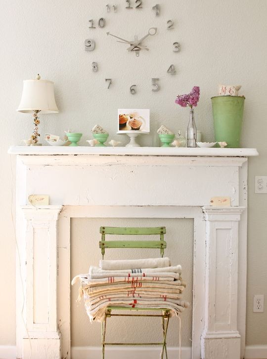
This clock I found on www.houzz.com

The 5-Foot French Tower Clock from Restoration Hardware is a classic reproduction that actually doesn’t keep time but does make a ‘timeless’ statement!  www.restorationhardware.com
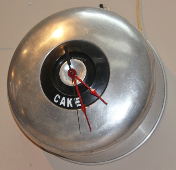
I photographed this artisan clock at Biltmore Domicile www.bdom.ca  located in the Distillery District.

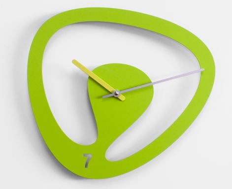
Seven by Karim Rashid wall clock in brightly painted steel.  Leave it to Karim to alter the standard form – 7 is the new 6!

6 Libero designed by Riccardo Paolino and Matteo Fusi.  Made of wood and stainless steel, the 6 has escaped by bending the bars of the prison.  Don’t just turn back time, take it back!

RND Time designed by RND Lab.  Small cubes may be assembled randomly on the wall. These white cubes pop against this chartreuse wall colour.  Fun!

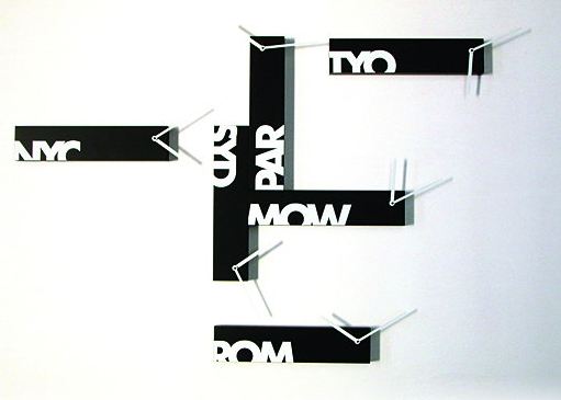
Souvenir 6 designed by Alberto Sala.  Keep time in 6 international cities – perfect for the jet setter.

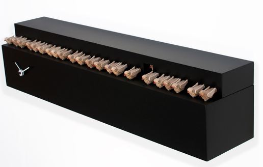
Fatti + in là designed by Studio Kuadra.  Telling time while keeping all your birds in a row makes this cuckoo clock an adventure in time.

The designers’ inspiration for the Fatti + in là!!

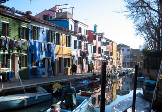
Burano designed by Eloisa Libera is a cuckoo clock that is reminiscent of the houses of the famous Burano Island in Venice Lagoon.

Burano Island in Venice Lagoon – the designer’s inspiration

So tic toc pick a clock which one would you choose?

Whatever way you keep time in your life have a great weekend and if you are observing Daylight Savings enjoy your extra hour.

Images 4-11 via www.progettishop.it

Black and Orange

I love the colour orange and I love the colour black but I personally try to avoid pairing them together in my décor.  When combined I associate these two colours as Halloween-like.  But in honour of today being Halloween I thought I would share some items that do exist [successfully] in black and orange.

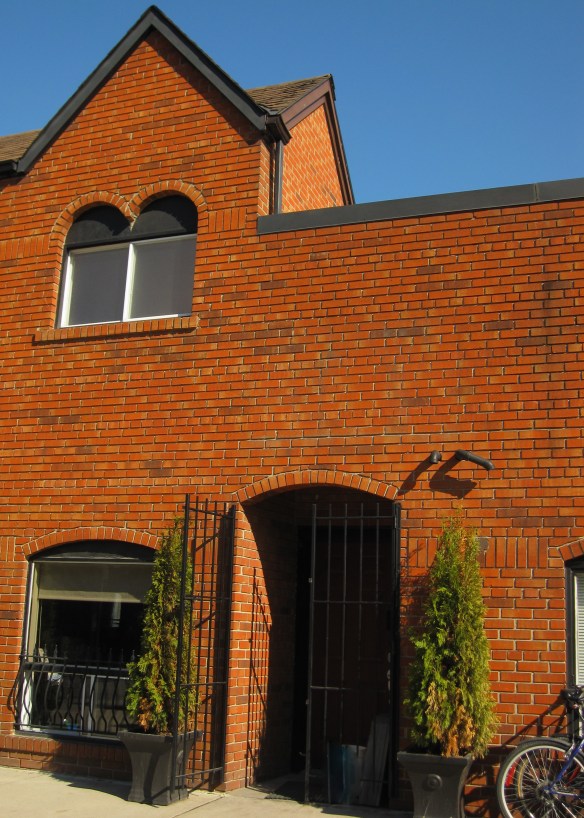
These terracotta coloured bricks appeared very orange in the bright afternoon sunlight combined with black wrought iron and trim work.

I saw this Enamel Vessel Pentad by Tom Dixon in a shop window.  Très décor!
The Magic Hole Chair designed by Philip Starck for Kartell.  Just a small pop of colour does make this black chair rather fun.

This contemporary coffee table designed by Jean Baptiste Sibertin Blanc is very mod!

This bathroom vanity definitely receives top marks for colour ingenuity!  Could you do it?
The Karlsson Mini Flip Wall Clock is something that I could set aside my no black/orange rule for.

Now wouldn’t this totally ‘decked out’ Porsche look great parked in front of my house!?

Hope you have a very fun-filled Halloween!

Fashion by Décor – When Inspiration Strikes!

Just wanted to share an outfit I wore for an evening out.  Constantly cruising the web looking at décor photos must have been the inspiration!

The boldly coloured living room appeared in Metropolitan Home (sadly now defunct) a number of years ago but is still quite fabulous.  I colour matched 3 Benjamin Moore paint colours from the photo and loved the combination.

Never know where inspiration strikes!


Nostalgia

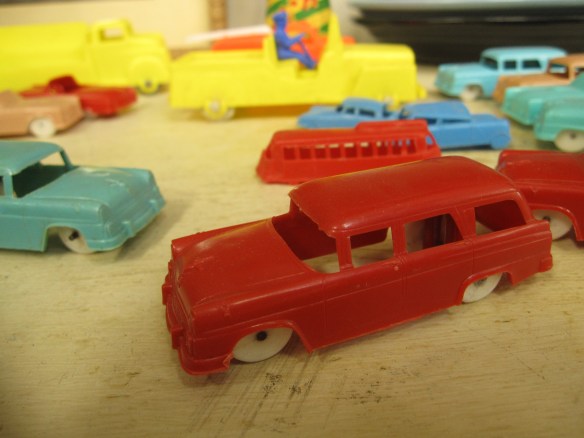
Nostalgia is defined as ‘a sentimental longing for the past’.

At what point in our life do we start to become nostalgic; begin to feel a sentimental longing?

Curious about the logic of ‘nostalgia’ I started asking younger family members and friends what they felt about a particular antique or item from the distant past.  Did it conjure up a certain feeling or a sense of longing for them?  Would they feel a sense of yearning yet?

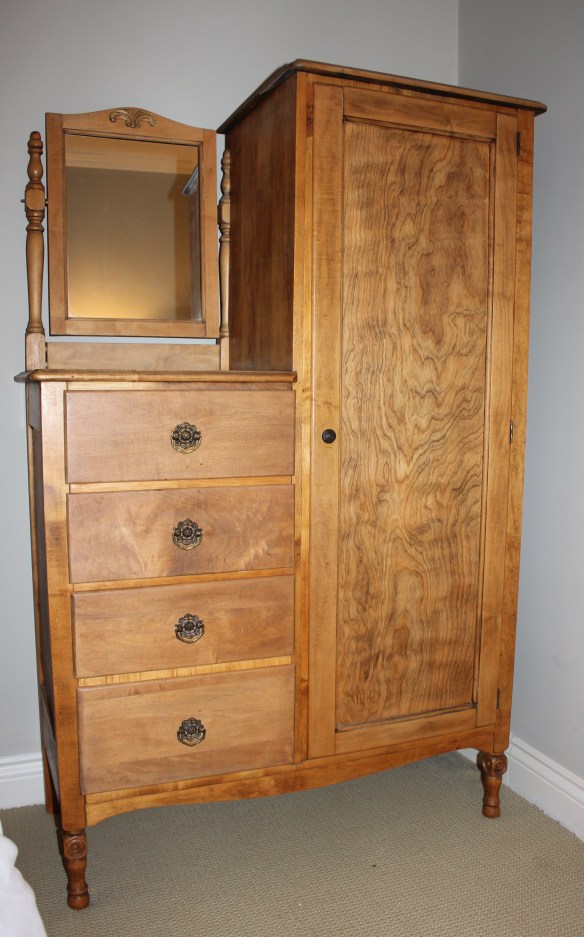
Ralph Lauren once said, “There is a way of living that has a certain grace and beauty.  It is not a constant race for what is next, rather, an appreciation of what has come before.”  Adding an antique or vintage item to a room can give the space a sense of history and soul.  Antiques are the signposts to our collective past.

I love visiting antique shops even though I lean more towards the contemporary when it comes to my homes décor, I find there is something sentimental about touching and seeing things from the past.  An old teacup reminds me of my Grandmother, the smell inside an antique oak hutch reminds me of my aunt’s Victorian home and a Sunbeam mixer pulls at my heartstrings reminding me of baking cakes as a child with my Mother.

So…..is it about going back and being inspired?  Or is it those who live in the past limit their future?

What makes you nostalgic??


My End of Summer Place

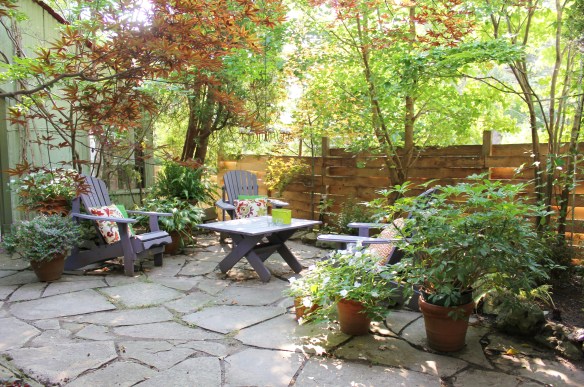
This weekend I am going to take advantage of the last days of summer.  The weather forecast looks promising for spending time lounging about in the backyard reading, hanging with friends and noshing on some delicious food.  Too quickly the leaves will start falling and the snow will begin to fly so I plan on grabbing all the summer memories I can.

Whatever your weekend may bring have a great one!

My ‘end of summer’ backyard.


My Martha (Stewart) Moment

It has been a while since I have written about my cottage renovation.  My story continues….

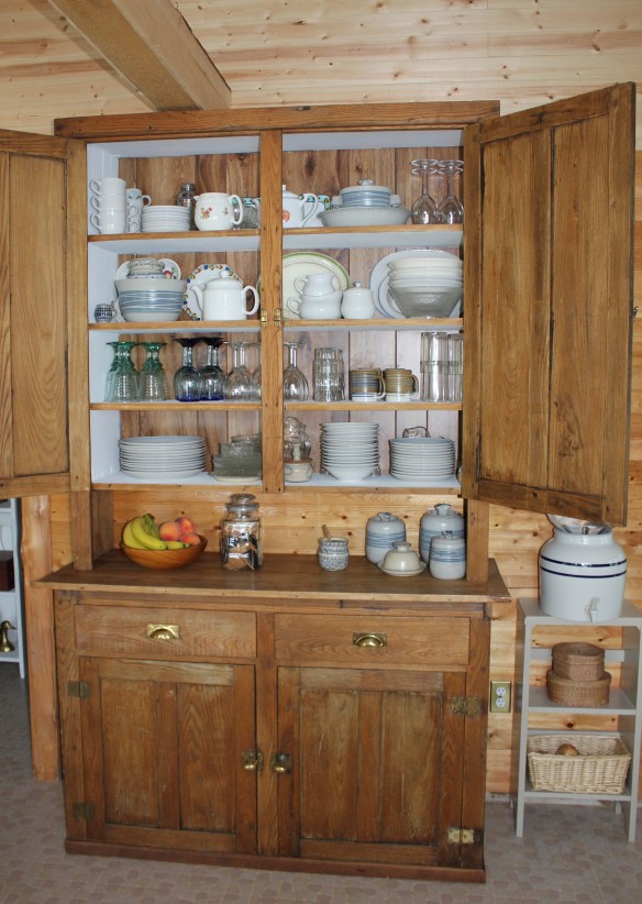
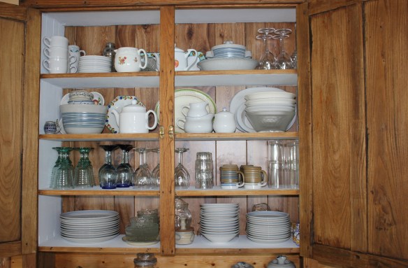
There were a few reasons why we decided to gut the interior space of the cottage the main one being that the ceilings were too low.  When my 6’2” son passed under the ceiling fan he had a good chance of being scalped by the whirring blades.  But we also had this fabulous antique hutch that we wanted to use but because it was taller than the ceiling height it languished in the boat house for over 10 years.  (Holding boat parts!)  I had purchased this hutch many years ago at the Aberfoyle Antique Market and it has moved with us from house to house, room to room.  The change to a more contemporary décor in our home meant that this large antique piece of furniture was out.  But not forgotten.  The hutch now has a proper purpose as the main storage unit in the cottage kitchen.  After a good cleaning and re-painting the hutch now houses all the plates/dishes/ glasses etc. etc.  so that all the kitchen ‘crockery’ is now in one place.  Amazing!

Every time I open the hutch doors I feel like I am having a ‘Martha (Stewart) Moment’!

Cooking and entertaining has taken on a whole new style – organized and fun.  As Martha would say, “It’s a good thing”.

All images via Modmissy

Ladies Lounge – after

A few weeks ago I wrote about my friend SW (SuperWoman) who was in the process of transforming her old wooden garage into a ‘ladies lounge’.

One year ago SW had decided that her garage could be better used as a backyard retreat rather than a storage space for ‘extra items’.

With a lot of love and elbow grease SW has achieved what she set out to do – she has turned a sow’s ear into a silk purse!

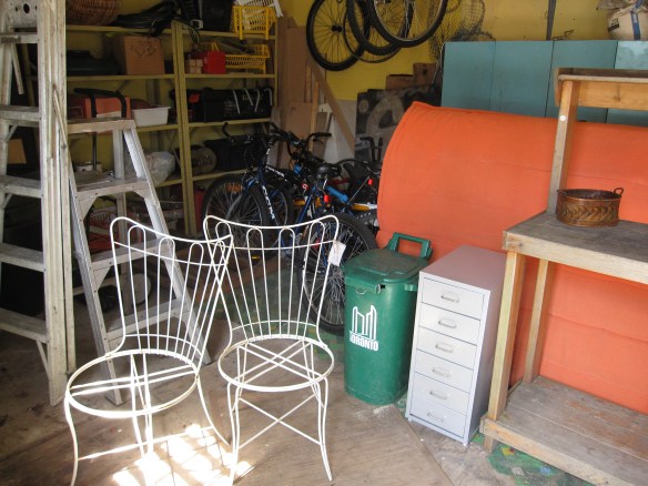
This was the ‘before’ photo with holes in the walls, old linoleum on the floor and lots of clutter:

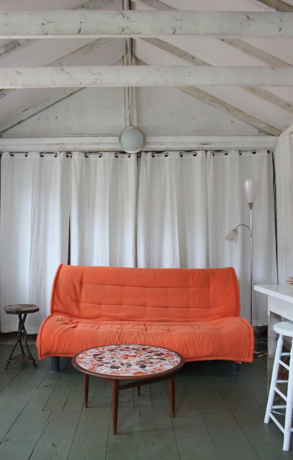
This is what SW’s efforts produced – the ‘after’ photo:

Bikes, tools, ladders and garden paraphernalia used to clutter the space.

Now everything is tucked away out of sight behind softly draping white curtains.

What was involved in the transformation?  The walls and ceiling were stripped back to the studs and sprayed a calming white.  An old brick fireplace chimney was removed.  The old linoleum was ripped up to reveal wood plank floors and then painted moss green.  Holes in the walls, floor and ceiling were repaired.  An old work bench was given a coat of white paint so that now it can be used as a bar and/or buffet table.  Furniture and accessories were brought in.  The orange futon provides the hit of colour in the room and a great place to take an afternoon nap.  The round teak table with inlaid mosaic top (a real score!) is a fabulous nod to mid-century modern not to mention a great surface for a game of Scrabble.  Any furniture that could was given a coat of white paint.  In the lofted ceiling a light that twinkles like the evening stars was wired in.

The lofted ceiling.

A pretty vignette.  And by the way, SW made most of the baskets in the space – yes she does basket weaving too!

So in her relentless pursuit of happiness, SuperWoman has moved mountains (and junk) to create a ‘getaway’ worthy of a super hero!!  Bravo SW.

All images via Modmissy


iYellow Wine Club at West Elm

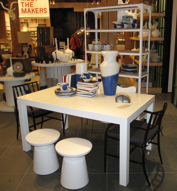
Last night I attended iYellow Wine Club Presents+Design Series by Crush VQA Wines at West Elm.  Beautiful food was provided by Mildred’s Temple.  I sipped, noshed and strolled through West Elm – fabulous way to shop!

Believing that great design should be affordable, West Elm’s furniture collection helps create living spaces that are stylish and unique.  And while searching for inspiration in far-away places, West Elm offers accessories that have an artisanal and organic flair to them.  Since I am in the middle of a cottage reno my focus was on ‘cottage style’.  It was interesting to see how West Elm’s style could be interpreted  to a lakeside, seaside, weekend space.

I thought this collection provided a contemporary spin on a nautical blue & white theme.

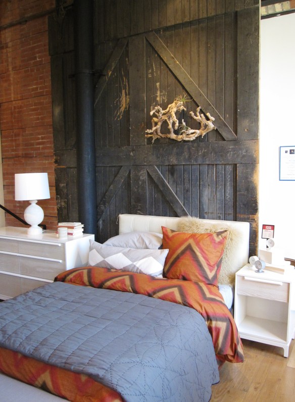
I loved this bedroom setting with the mix of barn board and contemporary furniture pieces with bedding in white, blue and cinnamon.

The organic blown glass pendant lights give an artisanal feel to any space.

White and muted pottery gives a relaxed vibe to a weekend space.

Red and white vases that have a resemblance to boat buoys and colourful pottery give an air of coastal charm.

Of course I found something that would be perfect in my cottage space so this weekend I shall add a little West Elm style to my lakeside retreat.

All images via Modmissy