O Canada!

This Sunday July 1st marks the 145th birthday of Canada.  Canada Day, originally called Dominion Day, celebrates the anniversary of the July 1st, 1867 union of colonies into a single country called Canada within the British Empire.

It’s the day when Canadians don their red and white, fly the flag and celebrate with parades and parties.  The Canadian flag adopted in 1965 is a red flag with a white square in the centre with an 11-point red maple leaf.  I like the design of the Canadian flag; there is a balance to the flag that gives a sense of stability and reassurance.  Good qualities for a country.

And just as important in the world of interior design is the scheme of balance.  A room in our home that is in harmony gives a balanced approach to everyday living.

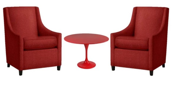
This seating arrangement, mirroring the design of the Canadian flag, has a balance to it that indicates comfort and reassurance – a sense of welcome.

Whether you are celebrating Canada Day or not may your weekend be full of harmony and happiness.

Cheers!

Images: Flag via Modmissy,  West Elm Sweep Arm Chair, Eero Saarinen Tulip Side Table

Inspiration Board – or not!

I always get ahead of myself or rather get ahead of the project.  Whenever my husband and I renovate (and we have been doing that for over 20 years!) he is still in the ‘bust and build’ state while I am already decorating the space.

We are on track renovating our cottage, the drywall is up and the new window is in, the kitchen cabinets are assembled and the countertop is ordered.  But way before all this I have been buying fabric, rugs, furniture accessories etc. all the little touches that will coordinate the final presentation.  Make the finished space just ‘right’.

I pulled together my inspiration board which is always helpful to visualize the space.

I pictured our cottage done in white, warm wood, sisal and hits of blue to give a pop of colour to the space.  I choose Benjamin Moore Oxford White CC-30 for the walls (new drywall) which is a nice bright white.  The long wall across from the windows is paneled in pine.   The sofa is an existing Bauhaus sectional that we have had for years and works really well in the space.  The sectional is in a neutral weave fabric of which I replaced the back cushion covers with natural canvas.  I bought a new area carpet – IKEA Tårnby, a natural fibre carpet that has a great textural appeal giving the room a warm organic look.

To keep the room bright I bought 3 coordinating fabrics that I will sew into cushions for the sofa.  Crisp blue and white fabrics with lots of white accessories in the room will give a fresh, lakeside feel to the cottage interior.  I decided to replace the existing large upholstered (red) chair as its size was not appropriate for the space.  I wanted something light coloured and airier in appearance.  On Craigslist I found a leather IKEA Poäng chair (wish it was an Alvar Aalto Lounge Chair! – check out my previous  post here) which I thought would be perfect for the room.  Gotta love Craigslist!

Ok…..so I had it all figured out.  I knew exactly in my mind how this space was going to look.  WRONG!!!!

This past weekend when we started to put the furniture, carpet, etc. back into the cottage I realized the room looked nothing like my inspiration board.  I think my biggest miscalculation was the light.  The natural light that floods the room from all the windows changes the sense of the room.  The colours – paint and fabric, the furniture etc. all read very different.

And I love it!

So stay tuned……….


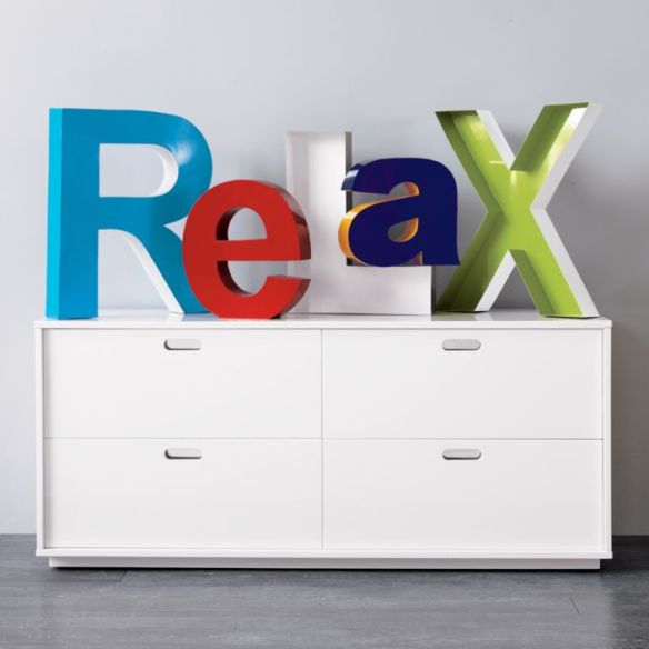
Relax!

It has been a crazy, busy week.

Hope you have a wonderful weekend.

And if you can, take time to unwind and relax.

Image via CB2


Choosing the Right White

Once upon a time………the decision of choosing the ‘right’ white was no problem.  Actually it never even occurred to me that more than one shade of white paint even existed!

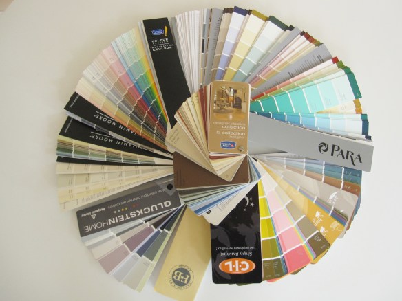
But now I pain myself over deciding the correct shade of white paint for my walls and trim.  And there are hundreds to choose from.  Dover White by Sherwin-Williams, Cloud White by Benjamin Moore, Cottage White by Behr, Natural White by Sico, Cameo White by Para; the list goes on and on.

When I bought my first home years ago and had to paint the walls there was only once choice of white paint – ‘D.J. Beige’.  Let me explain.  I had an uncle, Donald Joseph, affectionately known as D.J., who kindly offered his painting skills to each of us when we bought our first home.  D.J. would show up with his brushes, rollers, trays and gallons of paint.  I never knew the name of the paint D.J. had brought or even thought to ask.  It was just a ‘good’ colour that worked in all our homes.  It was D.J. Beige!

But now as I try to decide on the right white to paint the new walls of our cottage renovation I am puzzled.  What white will create that perfect feeling of relaxed calm lending itself to a weekend retreat that soothes the soul?  (That’s a lot of pressure on a paint colour!) I think I have my colour choices narrowed down so stay tuned.

PS.  Sometimes climbing a mountain is easier than choosing a paint colour!

That’s me – Mount Cascade, Alberta, Canada


Vondom

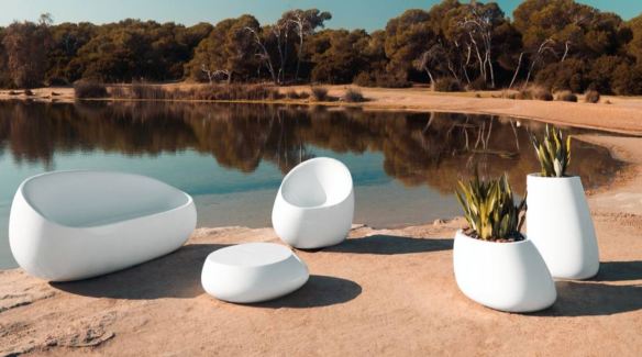
With the warm weather now here the majority of us will be heading to a ‘big box’ store to purchase our outdoor furniture but Vondom, a manufacturer of outdoor furniture, lighting and flowerpots takes the experience to a whole new level. Vondom collaborates with the most prestigious designers and architects of the world to create a new form of understanding in outdoor decoration. “VONDOM works to create art, always in search of the natural beauty of the product, giving them their own personality, always bearing in mind the vanguard of contemporary design, simply and balance.” Here are a few pieces from the vast collection of Vondom. Enjoy!

The Pillow Collection

The Rest Collection

The Stones Collection

The Vertex Collection

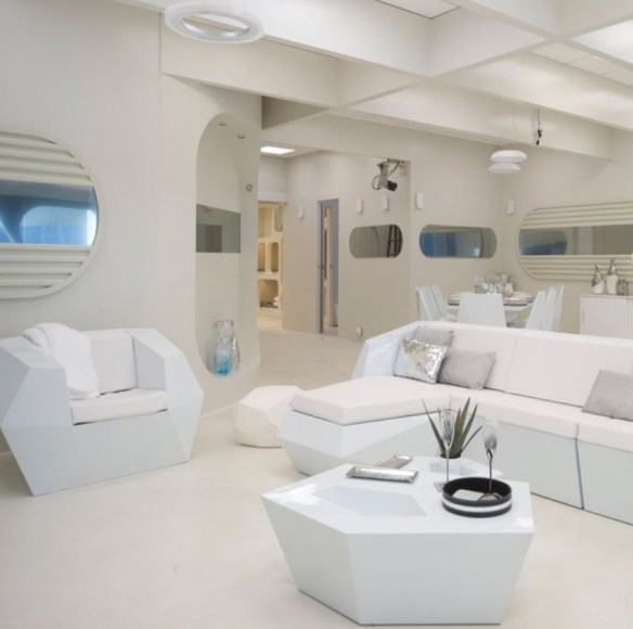
The Faz Collection – used indoors here.

The Vela Collection – lit by LED lights

The Quadrat Collection

All images Vondom.com

Bedroom Art

Last week I wrote about My White Bedroom and had many inquiries from people asking about the art on the walls.

The painting above the bed was done by my son a few years ago.   Since he was quite young I enrolled him in art classes each year.  At the end of each session we had a new canvas for our walls!  This piece is titled ‘Prairie Sky”.

The other painting in the room is a large piece that I have titled,  ‘On Top of the World’.

We came to own this piece in an unusual way.  Our neighbour had this painting sitting outside their backdoor for a few weeks.  Curious as to why a nice piece of art was sitting outside in the elements we inquired – “it’s rubbish”!  The story was that this had been a wedding gift but since the marriage had ended the painting was no longer wanted.  Understandable.  So we asked if we could have it and this large, colourful piece of art became ours.  One person’s trash, another person’s treasure!  And we truly do treasure this piece of art.  My walls are painted Benjamin Moore Florentine Plaster CC-520 with the rest of the room being fairly neutral so this colourful painting provides the pop of colour.

And by the way people also asked if my space is always that tidy……YES!

All images via Modmissy

My Front Porch – Summertime

I love going to fabric stores.  It is like an overload on the senses – looking, touching and imagining.  As I walk amongst the bolts of fabric, admiring the many beautiful fabrics, running my hands along them to feel them, my mind starts racing trying to envision where I could use them all.  So many gorgeous fabrics – not enough projects!

On a recent fabric store adventure I came across this fabulous orange/white fabric that I fell in love with – I bought 2 yards.

I decided to use the fabric for seat cushions on the chairs in my enclosed front porch.  My sewing skills gained from grade 7/8 Home Ec. are fairly rudimentary but I can sew cushion covers.

My front porch spring/summer cushions were looking faded and boring so the new orange/white gives the needed punch.  The patterned pillows which coordinated perfectly came from HomeSense thanks to a good friend who found them for me!  The twig furniture (hubby and I made many years ago), lots of potted flowers, good lighting to read with and candles in the evening makes this porch my summer oasis.

All Images via Modmissy


My Corner Fireplace Dilemma

When we purchased our home the basement was finished. Although many different definitions of ‘finished’ abound! The house is ~100 years old so a century ago the ‘cellar’ was never meant to live in. The basement was cold as insulation was not a factor in the home’s original construction. The previous owners tried to rectify this problem by installing a fireplace. A corner fireplace. Often considered to be the bane of designers! They also had a Santa Fe décor (note the purple wall colour) I believe to emulate warmth!? Due to the room’s layout the only place for the television was above the fireplace – terrible neck strain! Also, that meant that our sofa/sitting area was in the most narrow part of the room while the rest of the space was unused. We rectified this by flipping everything around. We got rid of the [ugly] corner fireplace and our solution to the cold factor was…..wait for it….insulation! In the process of figuring out the best solution as to how the room could be used we moved everything into different positions and lived with it for a while. After a long and dirty (we found out where at one time the furnace coal used to be stored) we now have a fabulous new ‘media’ room.

All images via Modmissy


Smile – it’s the Weekend!

This past week has been a little grey outside and the weekend is calling for rain.  Therefore I believe that the upcoming ‘colour’ forecast calls for some cheery yellow.  Add a splash of yellow in your life like this Pantone Yellow M colour chip.

If you are brave enough paint a feature wall in a guest bedroom, the inside of a cabinet or a small piece of furniture.  If that’s too much how about listening to soothing sounds from a Tivoli radio. www.tivoliaudio.com

How about pumping up the energy of a neutral kitchen with the Jake chair from Room and Board www.roomandboard.com .  Takes tea time to a whole new level.

This contemporary yellow sofa from www.bebitalia.it would definitely create a statement.

So wherever you find yourself this weekend I hope it is a cheery one. And remember – smile!!

Blue Shutters

Taking advantage of the nice weather yesterday I decided to get some exercise while the sun was still shining.  As I passed by this home now vacant and under major renovation the words of Forrest Gump played in my head, “You can tell a lot about a person by their shoes”.

Well there were no shoes lying about or construction boots either but the tell-tale signs were still present – the blue shutters.  The house had been sold and the previous owners are gone but the shutters still tell the story of who used to live there.  The shutters shade of blue was a paint colour very popular in the 1960’s and unless the previous owners were a young couple with a penchant for retro colours (which I highly doubt) this was the home where Grandma and Grandpa had lived for decades.   Colours have history.  In 1961 the Dulux® paint colour guide included Summer Blue, the same shade as these blue shutters.  Dulux no longer includes Summer Blue in their colour palette.  It’s dated.  (Just like clothing with huge shoulder pads that scream 1980!)

Blue is still a popular colour but it is the shade and hue that has changed to make it more current and up-to-date.  In the midst of all this renovation one can still tell that this home had been greatly loved and meticulously taken care of and I am sure the new owners will do the same but the blue shutters will be gone and replaced with colour that is more 2012-like.