My ‘Friday Space’ this week is inspired by the desire to getaway. March so often being the month for travelling to warm destinations I decided that lounging poolside is where I would like to spend time this weekend. The Saguaro Hotel in Scottsdale, Arizona is a colourful oasis that promises to both shock and calm at the same time. A departure from the usual colours of desert sand and kitschy Southwestern hues the Saguaro is alive with rich oranges, reds, vibrant pinks and violets that reference the desert wildflowers native to the nearby Sonoran Desert. In this photo I love how the orange umbrellas pop against the pink walls. (I am a huge fan of the combination of pink and orange.) I like the strong linear white roof line that draws your eye around. The purple building rising up from behind gives another pop of colour. The mature palm trees give the impression of being in a lush rainforest oasis. Even the rolled up beach towels lying at the foot of the chaises are bright pink. And in the middle of it all is the aqua blue pool tempting me to dip in, to relax and unwind. Pure ‘colourful’ heaven! Enjoy your weekend.
Category Archives: Design
Liyuan Library – Stick Memories
I came across an article in the recent Azure magazine www.azuremagazine.com titled Brand New Chapter written by Dan Levin about the new Liyuan Library in the Chinese village of Huairou located 2 hours from central Beijing. The library, designed and built by Beijing architect Li Xiaodong, helped resurrect the once forgotten rural village into a bustling weekend retreat for city dwellers. Upon visiting the village Li was “struck by the villagers close ties to the seasonal rhythms of nature and how natural textures define their constructed world, particularly the ritual of gathering sticks from the surrounding hills; they tie them in bundles for firewood and store outside their homes.” In his plans for the library Li decided to convey the ‘gathering of sticks’ philosophy into his design with a 2-storey steel frame building clad in 40,000 sticks. Nestled in a valley below the Great Wall of China, the library has become a sanctuary devoted to reading and a natural site for nesting birds.
After reading this article I was reminded of a childhood memory of the gathering of sticks. Seasonal rhythms are no more prevalent than here in Canada. With the changing of seasons we learn to adapt our life to nature. Our lifestyles change, our activities change with the changing seasons. For example, in summer time our activities are swimming, biking etc. whereas in winter our activities are hockey, skiing etc. When I was a kid everybody’s brother played hockey. More brothers, more time spent at the hockey arena. I have 2 brothers so I spent a lot of time at the hockey arena. I remember hearing about one particular father who used his time spent at the arena in the gathering of sticks – broken, discarded hockey sticks. Hockey sticks back then were made of hardwood, often birch, ash or maple and it was sad to think that after breaking from a hard slap shot these beautiful pieces of wood were castoffs. But this father had a vision; a repurposing idea. After years of collecting many sticks, this father with great pride and workmanship paneled his ‘rec room’ walls with hockey sticks! Except they were no longer hockey sticks, they were beautiful pieces of hardwood applied to the wall vertically to create a natural wall treatment. How very industrious and green-thinking of this father. Bravo!
All images courtesy of Li Xiaodong
Upon Closer Inspection
My Friday space this week is a living room designed by Orlando Diaz-Azcuy of Orlando Diaz-Azcuy Design Associates or ODADA. This Cuban-born American designer has had a significant impact on the contemporary practice of interior design. With degrees in Architecture, Landscape Architecture and City Planning, Diaz-Azcuy is a master in residential interiors, architecture, landscape design, furniture design and urban planning. While researching for a room that I would like to spend time in this weekend I came across this photo that depicted a lovely calm space; a bit more traditional looking than I usually prefer. But upon closer inspection I realized that the furniture was actually a ‘dramatic experiment’ in curved plywood. “Sweeps of glossy white vinyl lie atop a plywood “over-floor” and rise onto and over the simple plywood furniture forms—coffee table, daybed, and chairs. Beneath them an exposed ebony floor serves up high contrast to highlight the beauty of negative space.” Refined elegance but innovative modern at the same time. Outstanding!
Image via Matthew Millman
The Dinette Table
Entertaining at home has never been as popular as right now. With all the cooking shows on television and the fabulous cook books now available, so many of us have now found our ‘inner-chefs’. The dinner party has become the ‘au courant’ style of entertaining; sitting around the dining table sharing wonderful conversation, food, wine and laughter (more wine, more laughter!). The party often starts in the kitchen but usually ends gathering around a table – the dining table. Most homes have a dining room but so often the space must serve double or triple duty therefore the dining table is also a work desk, craft table, place to do homework or just a handy surface to place all stray belongings. For small spaces a dining table is not always a possibility given square footage restrictions so a surface to dine and entertain at becomes a design challenge. The kitchen island is now being designed with entertaining in mind. Coffee tables that convert into dining tables are becoming popular. A console table can be pulled into duty also. Of course there is always the door removed from its hinges method – I have a client who has done this for years. So I thought I would share with you my own dining table solution for small spaces. My dining table, originally my parents’, is a mid-1950’s Duncan Phyfe style that was built by Drexel Furniture. The table and matching buffet are both made of dark stained mahogany and have bow fronts. It is a lovely table that blends well with my contemporary décor. Mind you I would like to replace the chairs with something more modern i.e. Panton, Eames chairs. But the best part about this table is the ‘secret’ small space design adaptability. With 3 leaves my table seats up to eight people comfortably but with the removal of the leaves and the flip of the top, my table converts to a small desk. Ingenious! My ‘dinette’ table was the ‘high tech’ solution to small spaces during the 1950 and 1960’s. An idea that is well worth copying.
All images via Modmissy
Cabaret du Lapin Agile
As I have previously written, I grew up in the suburbs of Toronto. When my parents moved to the ‘burbs’ the neighborhood was then located next to farmland and was somewhat removed from the services and conveniences of the city. Therefore we had a milkman deliver our dairy products, the Fuller Brush man sell us brushes, the tinker man mended our household utensils and a man sell us vacuum cleaners; the list was lengthy. Don’t get me wrong, we did have stores nearby but I guess these ‘vendors’ saw a wealth of opportunity in all the new residents setting up house. Out of all these door-to-door merchants the ones I found most interesting were the artists selling their paintings. My parents had a lot of blank walls in their new suburbia home to fill so they bought 3 pieces of art from an artist who came to our door one day. I remember the artist was a young man who stated he had just returned from Europe where he had been painting the sights. All 3 paintings were done in oil; a water scene, a street scene and one with 3 children (Renaissance-style). These paintings became well-loved features in our home but sadly when our house was robbed in the mid-1980’s the thieves’ stole off with one of the paintings – the renaissance children one. I always found that rather curious – thieves with art knowledge!? Now years later the street scene painting hangs proudly in my home. I have looked at this piece of art for years (and loved it) but it was not until recently that I thought to do some research on it. The artist’s signature in the corner is undecipherable but on the side of one of the buildings is a name that I discovered after some ‘Google-ing’ reads Cabaret du Lapin Agile. French for the Nimble Rabbit Cabaret, the Lapin Agile is a famous Montmartre cabaret located in Paris, France that to this day is still open for business. The Lapin Agile originated in the mid-1800’s and over the years became a favorite spot for struggling artists and writers to frequent including Picasso, Modigliani and Utrillo. Around 1915, Maurice Utrillo painted in oil on board the Le Lapin Agile which recently sold for over $200,000 at Christie’s auction. My painting was painted circa 1960’s and sold to my parents for a fraction of the cost but to me it is priceless.
Image 1: via Modmissy Image 2: via Christie’s
Balance vs Symmetry
A room that is designed with symmetry is a room that is in a state of equilibrium. Every ying has it yang. A sofa in the centre of a seating arrangement, flanked by two end tables, coffee table and a pair of chairs. Matched and a sense of harmony. Whereas balance being a room with deliberate lack of symmetry. Not matched but feeling coordinated. It took me a long time to realize about myself that when it comes to my own personal space and décor, I prefer a room to look balanced without being symmetrical. Case in point – my living room. This room took me 3 sofas, actually 2 sofas and then finally a sectional sofa to realize that the room functions better and feels best when it is not decorated symmetrically. The wall between my living/dining room had been removed creating one large open room. On the long wall is the fireplace. Where it used to once sit centered in the living room the fireplace now sits at what feels like the end of the long wall. When I placed my sofa/furniture symmetrically on the fireplace the living room occupied a small space of the overall room. The living room felt small and there was too much space allotted to the dining area. I decided that the solution to this problem was to decorate asymmetrically around the fireplace and a sectional sofa allowed that to happen. My living room has been enlarged and occupies more of the space in the living/dining room. After this lengthy and $$$$ exercise I realized that I preferred my rooms when they were not symmetrical but rather balanced. I like my ‘vignettes’ mismatched and I favour items in odd numbers. I feel the asymmetrical ‘tension’ created makes the space more appealing to me.
All images via Modmissy
Your Weekend Travels
While researching for rooms that I would like to spend some time lounging in this weekend I came across this bedroom photo from www.roomandboard.com.
I chose this room for a few reasons. Overall it felt like a calm space, everything is fairly neutral except for the pop of colour coming from the orange pillow. The grey bedding is a colour that is on trend right now. I really love the large window that goes right to the floor flooding the room with natural light. The decision to go with bedside tables that are not identical appeals to my “non matchy, matchy” inclination. A very functional bedside reading lamp allows for easy bedtime reading. The black and white framed art above the bed offers interest. Of course the mid-century modern piece of furniture gets great applause. The Eames Molded Plywood Chair designed by Charles and Ray Eames in 1946 provides the ‘classic’ piece for the room. The acrylic lamp and glass table are the departure from having too much wood in the room. And of course one could not help but notice the large cowhide ottoman. But the main reason I chose this room is that it reminded of a place I had visited many years ago – South Africa. Actually it reminded me of the Rondavel I slept in while visiting the Kruger National Park located in the north-east part of South Africa. A Rondavel is a round hut with a thatched roof. Fairly rudimentary on the inside with 2 beds built from rough lumber and some basic storage. It was the design of the bed that reminded of the above photo. The legs of the bed rather than being recessed underneath the frame were at the edge. Since the Rondavel was tight on space I found myself repeatedly whacking my toes on the wooden legs while walking around the bed. I was lucky that I somehow managed to avoid breaking my toes. With over 7500 sq. miles of land to travel in the park there was no room for broken toes. Since then I have avoided purchasing any bedframes that have the legs on the edge as I know they are potentially hazardous for me! Also the cowhide on the ottoman reminds me of the many beautiful Springbok that I witnessed roaming naturally in the wilds of the Park. This trip was the trip of a lifetime and I love to be reminded of it any chance I get. So here’s to your weekend travels wherever they take you. Enjoy!
George Nelson Turbine Clock
It has been a while since I have written. One word – VIRUS!! But I am up and running and stronger than before. Big thanks to my big brother. This past weekend I finally did a drop-off of articles for donation to my local Value Village. This stuff had been rattling around in my car trunk for weeks. One of the items I donated was a chunky wood (pine) 1980’s era wall clock. Definitely not my style. So since I was there I just had to take a walk through ‘V. V. Boutique’ to see what possibilities lay inside and as usual I headed directly to the furniture section. Over the years I have seen some interesting items (retro lamps, pink Saarinen tulip table, Hudson Bay blankets, and crazy art work) so as luck would have it, there under a pile of stuff I spotted a George Nelson clock. The same George Nelson I wrote about in Marshmallow Sofa posted June 7th. https://modmissy.com/2011/06/page/2/. Upon closer inspection I realized that this was not an original George Nelson clock but a reproduction – but with a price tag of $6.99 I thought what the heck and bought it.
George Nelson designed the Turbine Clock in 1957 which “embodied the joie de vivre of the 1950’s”. Made of brass and aluminum, with a unique wedge-shaped hour hand, a simple minute hand and 12 ‘blades’ (or petals) marking the hour, the clock truly looks like a turbine .
A landmark of modern design, the Vitra Design Museum has introduced a re-edition of this unique timekeeper. Manufactured with great attention to original detail the Vitra George Nelson Turbine Clock can be purchased for $572. After further research I discovered that Kirch & Co. is also selling the George Nelson Pinewood Wall Clock. This reproduction version uses pinewood for the petals in an espresso finish just like the one I bought. The ticket price – $130. The high vs. low scenario. I thought it rather interesting; I donated one clock and purchased another.
Bookcases
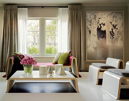
With these cold and dark winter days upon us there is nothing better than curling up and reading a good book. If you are a frequent visitor to your local public library or an e-reader you have probably not accumulated volumes of books. But for those who love to have their own book collection the problem of where to house all of them can become a challenge. Enter the bookcase. That veritable destination of all things written and bound, the bookcase has not been lost or phased out due to all the advances in technology. In fact the bookcase is still as popular as ever and has been updated and modernized in keeping with the times. Here are some examples. The first example is the one that got me thinking about bookcases. It was sent to me via an email so I do not know its origin, but very ingenious.

Next is Casamania’s Robox by Fabio Novembre. A life-size robot that is able to hold all your books thus becoming the new domestic hero.
The wall mounted Aluminum Bookcase designed by Julien Vidame has a wonderful ‘undulating’ feel to it. I liked this one.
Similar to a traditional bookcase is the Shanghai Bookcase designed by Giuseppe Bavuso. The external structure is made of black stained oak but the tilted inner shelves are made of cement. Composed of organic materials, this bookcase may be recycled at the end of its lifetime. Very green thinking.
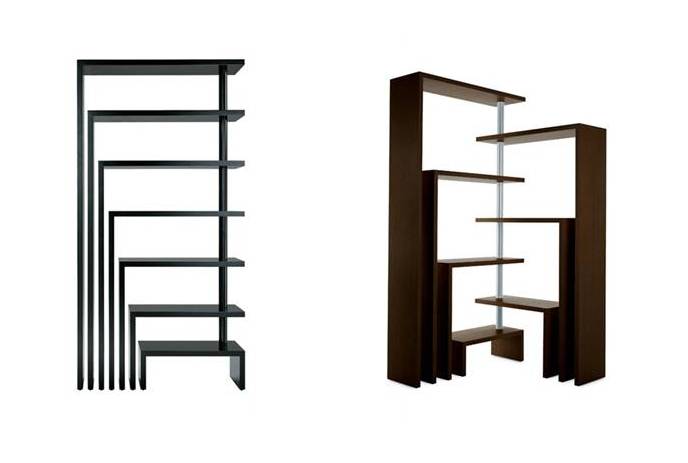
The Oto 100 is a sectional bookcase designed by Pil Bredahl that is quite a departure from the norm. This bookcase is made for the modern nomad who is constantly on the move. Made of fiberglass, this sculptural bookcase is easily assembled (and disassembled) into any formation you wish. I like the style of bookcase that allows for constant ‘change’.
Another option is the swivel bookcase, Zanotta’s Joy designed by Achille Castiglioni.
And I don’t think I could write about bookcases without mentioning the internationally well-known Billy by Ikea. Over 40 million of these flat-packed iconic bookcases have been sold since it was first created in 1979. All of the bookcases I mentioned are high in style and personality; a shame to load them up with books. So as the American poet once wrote in his comic poem, Shake, Mulleary and Go-ethe,
“I have a bookcase which is what,
Many much better men have not.
There are no books inside, for books
I am afraid might spoil its looks.”
High vs Low – full moon light
Have you noticed popping up everywhere recently in design magazines, design shows and stores is what I like to call the ‘full moon’ light fixture? A white round sphere, made of a string-like material with a light bulb suspended in the centre. The Random Light from Moooi www.moooi.com was designed in 2001 by Bertjan Pot.
The Random Light diffuses a feeling of simplicity and lightness with a touch of magic in contemporary style. “The production process is a special story by itself: a resin drained yarn is randomly coiled around an inflatable beach ball creating a translucent 3D fabric. The beach ball is then deflated and extracted from a round opening in the lamp. At the end the skin becomes the product.” Kind of reminds me of when I was a kid, taking white glue and string and wrapping them around a balloon to make one of the planets for a science project!? Available in 3 sizes, 50cm, 80cm, 105cm and 2 colours, white or black, with a price starting at $600. The Random Light became a best seller right from the beginning but did not hit mainstream until recently. Structube www.structube.com has their interpretation, the Globe that is very similar to the Random Light but the Globe is the affordable version in the High vs. Low scenario.
Available in 2 sizes, 40 cm and 60 cm and 2 colours, white or dark brown, the Globe’s price of $89 and $139 makes this light fixture an affordable alternative. So either way, whichever version you can afford the ‘full moon’ light fixture will emit cosmic style to any room.


