My Corner Fireplace Dilemma

When we purchased our home the basement was finished. Although many different definitions of ‘finished’ abound! The house is ~100 years old so a century ago the ‘cellar’ was never meant to live in. The basement was cold as insulation was not a factor in the home’s original construction. The previous owners tried to rectify this problem by installing a fireplace. A corner fireplace. Often considered to be the bane of designers! They also had a Santa Fe décor (note the purple wall colour) I believe to emulate warmth!? Due to the room’s layout the only place for the television was above the fireplace – terrible neck strain! Also, that meant that our sofa/sitting area was in the most narrow part of the room while the rest of the space was unused. We rectified this by flipping everything around. We got rid of the [ugly] corner fireplace and our solution to the cold factor was…..wait for it….insulation! In the process of figuring out the best solution as to how the room could be used we moved everything into different positions and lived with it for a while. After a long and dirty (we found out where at one time the furnace coal used to be stored) we now have a fabulous new ‘media’ room.

All images via Modmissy


Blue Shutters

Taking advantage of the nice weather yesterday I decided to get some exercise while the sun was still shining.  As I passed by this home now vacant and under major renovation the words of Forrest Gump played in my head, “You can tell a lot about a person by their shoes”.

Well there were no shoes lying about or construction boots either but the tell-tale signs were still present – the blue shutters.  The house had been sold and the previous owners are gone but the shutters still tell the story of who used to live there.  The shutters shade of blue was a paint colour very popular in the 1960’s and unless the previous owners were a young couple with a penchant for retro colours (which I highly doubt) this was the home where Grandma and Grandpa had lived for decades.   Colours have history.  In 1961 the Dulux® paint colour guide included Summer Blue, the same shade as these blue shutters.  Dulux no longer includes Summer Blue in their colour palette.  It’s dated.  (Just like clothing with huge shoulder pads that scream 1980!)

Blue is still a popular colour but it is the shade and hue that has changed to make it more current and up-to-date.  In the midst of all this renovation one can still tell that this home had been greatly loved and meticulously taken care of and I am sure the new owners will do the same but the blue shutters will be gone and replaced with colour that is more 2012-like.

Garden Mirrors

My backyard is both my sanctuary and my little ‘green space’ in the city.  I look forward to being able to return to my summer hangout.  But until the warm weather is here I can patiently only watch spring’s progress in my backyard.  From my kitchen window, which is elevated above the backyard, I have a bird’s eye view to observe all the activity going on.  The buds on the trees are just starting to come out and some of the perennials are beginning to poke up out of the soil.  And the birds are so busy at this time of year.  Blue Jays, robins and cardinals are constantly flying about; looking for mates and starting to nest.  But here is the thing – I have a garden mirror that hangs on a wall in the backyard.  The mirror tucked in behind some greenery gives the appearance of creating visual space where none exists.  My yard is small so this ‘trompe l’oeil’ (French for ‘fool the eye’) is perfect for tricking one into believing that my backyard is spacious.  Same tactic as when a mirror is used inside a home.  But each spring I have to cover the mirror over with a plastic sheet to prevent birds from hurting themselves.  The birds, mostly robins, upon seeing their reflection in the mirror believe it to be another bird that is in their territory.  The bird fights itself to such a length that I have noticed blood on the mirror.  Not nice for the bird!  So I thought I would pass this info on to anyone who may have a garden mirror.  Cover over the mirror during springtime until the birds are finished mating.

A photo of a robin in spring – let’s protect him.

My garden mirror in spring before plant foilage covers over.

My garden mirror in summer somewhat hidden from surrounding foilage.

All images via Modmissy

EJ 144

This past weekend I visited the Art Gallery of Ontario (AGO).  I love visiting galleries and museums not only to view the outstanding art and exhibits but to be witness to the architecture of the building that houses the outstanding art.  Often the architecture is as much a spectacle as the art.  The most recent renovation to the AGO, architect Frank Gehry’s design made the connection between art and architecture.  Upon entering into the first part of the gallery you walk into a large open hub; Walker Court.  Immediately you are hit by the spectacle of the architecture; the dramatic spiral staircase, the abundance of Douglas fir and the high arched doorways.  As gallery-goers entered and walked around this space I noticed that most were looking up taking in the amazing sights.  Often overlooked in public spaces though are details that although do not take centre stage are just as interesting.  In Walker Court were 2 upholstered benches.  Unlike all the art in the gallery, I was able to touch and inspect these benches.  So I got down on my hands and knees and discovered that the tag on the bottom (no easy feat) indicated that the bench was made in Denmark by Erik Jørgensen www.erik-joergensen.com.  The bench – EJ 144 (One for Four) was designed by Anne-Mette Bartholin Jensen and Morten Ernst.  The big horizontal surface, smooth black fibre-glass construction and transparent base gives “the appearance of a membrane separating heaven from earth”.  The bench is also available in a single version, EJ 141 (One for One).  I am sure the intention of placing these 2 benches in this outstanding space was a well thought out design decision because what you sit on to experience art and architecture is just as important. 

Liyuan Library – Stick Memories

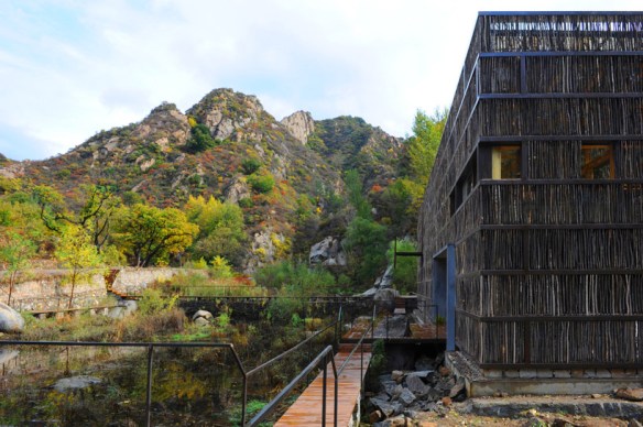
I came across an article in the recent Azure magazine www.azuremagazine.com titled Brand New Chapter written by Dan Levin about the new Liyuan Library in the Chinese village of Huairou located 2 hours from central Beijing.  The library, designed and built by Beijing architect Li Xiaodong, helped resurrect the once forgotten rural village into a bustling weekend retreat for city dwellers.  Upon visiting the village Li was “struck by the villagers close ties to the seasonal rhythms of nature and how natural textures define their constructed world, particularly the ritual of gathering sticks from the surrounding hills; they tie them in bundles for firewood and store outside their homes.”  In his plans for the library Li decided to convey the ‘gathering of sticks’ philosophy into his design with a 2-storey steel frame building clad in 40,000 sticks.  Nestled in a valley below the Great Wall of China, the library has become a sanctuary devoted to reading and a natural site for nesting birds.

 After reading this article I was reminded of a childhood memory of the gathering of sticks.  Seasonal rhythms are no more prevalent than here in Canada.  With the changing of seasons we learn to adapt our life to nature.  Our lifestyles change, our activities change with the changing seasons.  For example, in summer time our activities are swimming, biking etc. whereas in winter our activities are hockey, skiing etc.  When I was a kid everybody’s brother played hockey.  More brothers, more time spent at the hockey arena.  I have 2 brothers so I spent a lot of time at the hockey arena.  I remember hearing about one particular father who used his time spent at the arena in the gathering of sticks – broken, discarded hockey sticks.  Hockey sticks back then were made of hardwood, often birch, ash or maple and it was sad to think that after breaking from a hard slap shot these beautiful pieces of wood were castoffs.  But this father had a vision; a repurposing idea.  After years of collecting many sticks, this father with great pride and workmanship paneled his ‘rec room’ walls with hockey sticks!  Except they were no longer hockey sticks, they were beautiful pieces of hardwood applied to the wall vertically to create a natural wall treatment.  How very industrious and green-thinking of this father.  Bravo!

All images courtesy of Li Xiaodong

Riverside Architecture

It may seem that I have a preference for contemporary architecture and that I lean towards the mid-century modern style but I do appreciate other eras.  Recently while on a search for the perfect orange coloured fabric (time to replace the chartreuse yellow cushion on my living room sofa – see post April 7th) I ended up in the Riverside district, located just east of downtown Toronto.  It was such a beautiful day and while looking up and admiring the bright blue sky I also happened to notice the great architecture that was around me.   At the corner of Queen and Saulter, is an outstanding example of some of the older architecture in Toronto.  Built in 1913 and designed by architect E.J. Lennox, (who also designed Toronto’s ’Old City Hall’) the building originally housed a post office, then a Town Hall and now it is home to the Queen/Saulter Library.  The building is truly ‘photo worthy’ and so I snapped away.  If I had not told you that this building was in Toronto you may have thought I had just returned from a vacation in Europe. 


Across the street I spotted another ‘photo worthy’ example of older Toronto architecture.  At the corner of Queen and Boulton St is the Poulton Block.  This building was constructed in 1885 for William B. Poulton, a painter and a Mason, as a Masonic Orient Lodge.  The building was designed by Kennedy, Gaviller and Holland Architects in the Gothic Revival style.  From 1888 to 1910, Toronto’s first library east of the Don River was housed in rooms at the back of this building.  Once again I snapped a bunch of photos.  Through the wonders of technology I was able to view the photos asap and noticed that the shots of the Poulton Block made the building appear as if it existed as only one wall!  It was as if you looked right through the windows and out the back of the building but actually it was the reflection of the sky from the very tall windows. 


I like these photos and am thinking about enlarging them to black and white or maybe sepia toned and framing them.  Actually a friend has been looking for some architecture prints for above her sofa so I may consider that too. 

All Images via Modmissy


Crooked Trees, Bent Plywood

I recently came across this interesting photo of the bent, crooked trees that grow in a forest in Poland. 


The photo reminded me of Alvar Aalto’s laminated bent-plywood High Stool.  Aalto, born in Finland in 1898 was a Finnish architect and designer whose work included architecture, interior design, furniture design, glassware design and painting.  Throughout his entire career Aalto designed approximately 300 buildings which were built mostly in Finland with a few in the United States, Germany, Italy and France.  The High Stool was designed in the early 1930’s resulting from the process of experimenting with wood while creating small-scale architectural details and forms which were later to be used in his architectural designs.  Aalto, in a speech given in London 1957 stated, “We should work for simple, good, undecorated things, but things which are in harmony with the human being and organically suited to the little man in the street”.  Alvar Aalto was definitely a person with great insight and a forward thinker. 


                       Image 1: viewshound.com    Image 2: Modmissy

Modern McDonald’s?

Have you noticed anything new on the horizon of late?  Ok, I will narrow that down a bit.  Have you noticed the new, re-designed, contemporary-looking McDonalds’s?  The world’s largest hamburger chain that serves millions of people around the globe every day is having a makeover, a facelift.  Keeping in line with their ‘forever young’ brand, McDonald’s restaurants are losing the plastic-heavy, childlike look and presenting a more contemporary, youthful face.  Gone is the signature mansard roof, the bright red and yellow colours and the loud tell-tale golden arches.  I always associated the restaurant as a ‘jungle gym’, romper room type of playhouse; not a place to eat.  Instead the new design of the exterior presents a building with contemporary architecture that is subtle and clean lined.  The roof is now flat and partially cantilevered; the colours are grey, white and a muted red.  Materials include natural and cultured stone.  Very nice touch.  The golden arches are still present but not as big of a focus.   Even the outdoor seating is more edgy and hipper looking.  Although I have not made it inside to check out the interior re-design I am told the old plastic seating has been replaced with leather furniture, plasma televisions and fireplaces.   The ‘new’ McDonald’s is much more architecturally interesting with greater curb appeal and I confess that it now gets my attention.  But would I falter from my claim to fame of “I have never in my life eaten a McDonald’s hamburger”?  Hmmmm?  But hey, I like the ‘tasteful’ new design!


          The BEFORE and AFTER Photos.  What was vs. What now is!


      Image via Modmissy

Leuty Lifeguard Station

What makes a building or structure so iconic?  Is it that the architecture is a marvel and a masterpiece?  Or does a renowned individual have to lay claim to its design.  Must the building be very unique and exclusive in its style and construction?  Or is it essential that the building be award-winning and internationally acclaimed?  Often a building or structure will singularly define a city and/or country.  Paris is known for its Eiffel Tower, Australia for the Sydney Opera House, New York City for the Statue of Liberty, London for the Tower Bridge, Dubai for the Burj-Al-Arab, India for Taj Mahal and Egypt for its Pyramids.  The list is lengthy.  But sometimes an ‘iconic’ building is simply no more than a building in a neighborhood that has become embedded into the hearts of the local residents.  One such building in my neighborhood is the Leuty Lifeguard Station.  Built in the 1920’s the small, simple wooden structure sitting at the water’s edge has stood the test of time.  It is still used every summer as a lifeguard station to monitor swimmers at the lake but it is also a spot well-known for “I’ll meet you at the lifeguard station” destination and the place where a ‘first kiss’ often occurs and where many great ‘photo ops’ are shot and a favourite scene for artists to capture.   A few years ago a S.O.S. (Save our Station) went out as a massive restoration $$ was required.  The local residents rallied and the Station was saved.  Couldn’t let an old friend down!  So what building is iconic for you?  Let me know.


           Images via Modmissy

CN Tower

The CN Tower is my beacon in Toronto.  It seems no matter where I go within the city I can always see the CN Tower.  Driving down my neighborhood street, from a plane window flying out of Toronto, perfectly framed between 2 of my favourite Mies van der Rohe buildings, riding my bike, out for an evening stroll.  It follows my like a symbol of strength.    Although the CN Tower inspires a sense of pride and inspiration for Canadians and a sense of awe for foreign tourists, its origins are rooted in practicality.   The rise of skyscrapers within Toronto beginning in the 1960’s caused serious communications problems for existing transmission towers, which were simply not high enough to broadcast over the new buildings. Signals bounced off the buildings creating poor television and radio reception for residents.  The CN Tower was the solution to the communications problems and remains the centre of telecommunications for Toronto.   The CN Tower was built by Canadian National (hence CN) Railway in 1976.  The massive project took 40 months to complete and when the final piece of the antenna was bolted into place on April 2, 1975 the CN Tower became the ‘World’s Tallest Free-Standing Structure’; a record the Tower held for an incredible 34+ years.   The CN Tower remains an internationally renowned architectural triumph, an engineering ‘Wonder of the Modern World’, world-class entertainment and dining destination and a must see for anyone visiting Toronto.   But for me it’s the pillar of strength that follows me where ever I go in T.O!


                                 All Images via MODMISSY