Your Weekend Travels

While researching for rooms that I would like to spend some time lounging in this weekend I came across this bedroom photo from www.roomandboard.com

I chose this room for a few reasons.  Overall it felt like a calm space, everything is fairly neutral except for the pop of colour coming from the orange pillow.  The grey bedding is a colour that is on trend right now.  I really love the large window that goes right to the floor flooding the room with natural light.  The decision to go with bedside tables that are not identical appeals to my “non matchy, matchy” inclination.  A very functional bedside reading lamp allows for easy bedtime reading.  The black and white framed art above the bed offers interest.  Of course the mid-century modern piece of furniture gets great applause.  The Eames Molded Plywood Chair designed by Charles and Ray Eames in 1946 provides the ‘classic’ piece for the room.  The acrylic lamp and glass table are the departure from having too much wood in the room.  And of course one could not help but notice the large cowhide ottoman.  But the main reason I chose this room is that it reminded of a place I had visited many years ago – South Africa.  Actually it reminded me of the Rondavel I slept in while visiting the Kruger National Park located in the north-east part of South Africa.  A Rondavel is a round hut with a thatched roof.  Fairly rudimentary on the inside with 2 beds built from rough lumber and some basic storage.  It was the design of the bed that reminded of the above photo.  The legs of the bed rather than being recessed underneath the frame were at the edge.  Since the Rondavel was tight on space I found myself repeatedly whacking my toes on the wooden legs while walking around the bed.  I was lucky that I somehow managed to avoid breaking my toes.  With over 7500 sq. miles of land to travel in the park there was no room for broken toes.  Since then I have avoided purchasing any bedframes that have the legs on the edge as I know they are potentially hazardous for me!  Also the cowhide on the ottoman reminds me of the many beautiful Springbok that I witnessed roaming naturally in the wilds of the Park.  This trip was the trip of a lifetime and I love to be reminded of it any chance I get.  So here’s to your weekend travels wherever they take you.  Enjoy!


Group of Seven Outdoor Gallery

Yesterday I was in the District of Muskoka, affectionately known as ‘Muskoka’, located in Central Ontario, about 2 hours north of Toronto.  With almost 1600 lakes, numerous picturesque towns and villages and many lakeside vacation spots, Muskoka is an ideal ‘cottage country’ and tourist destination.  Not to mention – extremely beautiful.  Muskoka also includes the western border of Algonquin Provincial Park.  We stopped in the town of Baysville and had lunch at Miss Nelles, a café and antique shop that is in a charming building originally built in 1872.  

After parking the car and having a look around, I noticed on the side of the building a mural of The Pines by the Group of Seven artist Lawren Harris. 


I soon discovered that this mural (painted by Gerry Lantaigne) is part of the Muskoka Group of Seven Outdoor Gallery; a self-directed tour that is located throughout Huntsville, Lake of Bays and Algonquin Park.  The ~100 murals painted by some of Canada’s top mural artists whose mandate was to re-create the masterpieces, as close as possible to the originals painted by Tom Thomson and the Group of Seven.  Gerry Lantaigne, founder and artistic director of this outdoor gallery, writes, “These murals represent our natural landscape, and so fittingly help us tell a story about ourselves.  Tom Thomson and the Group of Seven were spurred on by the ideals of Algonquin Park and the Canadian northland, this group of friends ventured into the wilderness as voyageurs with their canvas and paints, and discovered their expression for their Canadian ideals in art.  The works in the collection are an homage to these painters, and the goals they achieved.”  There are 5 murals in Baysville so this summer I plan on returning to Muskoka to try to view the 95 other! 

 All images via Modmissy

George Nelson Turbine Clock

It has been a while since I have written.  One word – VIRUS!!  But I am up and running and stronger than before. Big thanks to my big brother.  This past weekend I finally did a drop-off of articles for donation to my local Value Village.  This stuff had been rattling around in my car trunk for weeks.  One of the items I donated was a chunky wood (pine) 1980’s era wall clock.  Definitely not my style.  So since I was there I just had to take a walk through ‘V. V. Boutique’ to see what possibilities lay inside and as usual I headed directly to the furniture section.  Over the years I have seen some interesting items (retro lamps, pink Saarinen tulip table, Hudson Bay blankets, and crazy art work) so as luck would have it, there under a pile of stuff I spotted a George Nelson clock.  The same George Nelson I wrote about in Marshmallow Sofa posted June 7thhttps://modmissy.com/2011/06/page/2/.  Upon closer inspection I realized that this was not an original George Nelson clock but a reproduction – but with a price tag of $6.99 I thought what the heck and bought it. 


George Nelson designed the Turbine Clock in 1957 which “embodied the joie de vivre of the 1950’s”.  Made of brass and aluminum, with a unique wedge-shaped hour hand, a simple minute hand and 12 ‘blades’ (or petals) marking the hour, the clock truly looks like a turbine . 


A landmark of modern design, the Vitra Design Museum has introduced a re-edition of this unique timekeeper.   Manufactured with great attention to original detail the Vitra George Nelson Turbine Clock can be purchased for $572.  After further research I discovered that Kirch & Co. is also selling the George Nelson Pinewood Wall Clock.  This reproduction version uses pinewood for the petals in an espresso finish just like the one I bought.  The ticket price – $130.  The high vs. low scenario.  I thought it rather interesting; I donated one clock and purchased another. 


Bookcases

With these cold and dark winter days upon us there is nothing better than curling up and reading a good book.  If you are a frequent visitor to your local public library or an e-reader you have probably not accumulated volumes of books.   But for those who love to have their own book collection the problem of where to house all of them can become a challenge.  Enter the bookcase.  That veritable destination of all things written and bound, the bookcase has not been lost or phased out due to all the advances in technology.  In fact the bookcase is still as popular as ever and has been updated and modernized in keeping with the times.  Here are some examples.  The first example is the one that got me thinking about bookcases.  It was sent to me via an email so I do not know its origin, but very ingenious. 

Next is Casamania’s Robox by Fabio Novembre.  A life-size robot that is able to hold all your books thus becoming the new domestic hero. 

The wall mounted Aluminum Bookcase designed by Julien Vidame has a wonderful ‘undulating’ feel to it.  I liked this one.

Similar to a traditional bookcase is the Shanghai Bookcase designed by Giuseppe Bavuso.  The external structure is made of black stained oak but the tilted inner shelves are made of cement.  Composed of organic materials, this bookcase may be recycled at the end of its lifetime.  Very green thinking.

The Oto 100 is a sectional bookcase designed by Pil Bredahl that is quite a departure from the norm.  This bookcase is made for the modern nomad who is constantly on the move.  Made of fiberglass, this sculptural bookcase is easily assembled (and disassembled) into any formation you wish.  I like the style of bookcase that allows for constant ‘change’.

Another option is the swivel bookcase, Zanotta’s Joy designed by Achille Castiglioni.

And I don’t think I could write about bookcases without mentioning the internationally well-known Billy by Ikea.  Over 40 million of these flat-packed iconic bookcases have been sold since it was first created in 1979.  All of the bookcases I mentioned are high in style and personality; a shame to load them up with books.  So as the American poet once wrote in his comic poem, Shake, Mulleary and Go-ethe,

     “I have a bookcase which is what,

      Many much better men have not.

           There are no books inside, for books

      I am afraid might spoil its looks.”


Peace

Peace.  John Lennon sang about it, “Imagine all the people living life in peace.”  Carlos Santana said “The most powerful weapon you can be is an instrument of peace.”  And of course Mother Teresa’s words of inspiration, “Peace begins with a smile”.  Growing up in the 60’s and 70’s my lexicon of idioms included ‘groovy baby’, ‘mod’, ‘cool’, dig it and of course ‘peace’.  ‘Mod’ has definitely stuck around for me and ‘peace’, well I love that one too although I no longer go around saying, “hey, peace baby” but I do love the peace symbol.  The internationally recognized symbol for peace was designed in 1958 for the nuclear disarmament movement.  The symbol is a combination of the semaphore signals for the letters ‘N’ and ‘D’ representing nuclear disarmament; semaphore being the system used for conveying information at a distance by means of hand-held flags. 


I must confess though I still love things with the peace symbol on them.  I have a black vest that I purchased in the ‘80’s (that I won’t part with) and a belt buckle that I recently purchased with the symbol.


So it was no surprise that when I came across Jonathan Adler’s www.jonathanadler.com Mod Peace Footstool I fell in love.  The handmade, 100% wool, needlepoint top on a fabulous green stool is a sure way to bring the thought of peace to your home.  Peace baby!


High vs Low – full moon light

Have you noticed popping up everywhere recently in design magazines, design shows and stores is what I like to call the ‘full moon’ light fixture?  A white round sphere, made of a string-like material with a light bulb suspended in the centre.  The Random Light from Moooi www.moooi.com was designed in 2001 by Bertjan Pot. 

The Random Light diffuses a feeling of simplicity and lightness with a touch of magic in contemporary style.  “The production process is a special story by itself: a resin drained yarn is randomly coiled around an inflatable beach ball creating a translucent 3D fabric. The beach ball is then deflated and extracted from a round opening in the lamp. At the end the skin becomes the product.”  Kind of reminds me of when I was a kid, taking white glue and string and wrapping them around a balloon to make one of the planets for a science project!?  Available in 3 sizes, 50cm, 80cm, 105cm and 2 colours, white or black, with a price starting at $600.  The Random Light became a best seller right from the beginning but did not hit mainstream until recently.  Structube www.structube.com  has their interpretation, the Globe that is very similar to the Random Light but the Globe is the affordable version in the High vs. Low scenario. 

Available in 2 sizes, 40 cm and 60 cm and 2 colours, white or dark brown, the Globe’s price of $89 and $139 makes this light fixture an affordable alternative.  So either way, whichever version you can afford the ‘full moon’ light fixture will emit cosmic style to any room.

My New (Old) Chair

As I previously mentioned my MIL (mother-in-law) has just downsized and moved into a beautiful new condo.  Unfortunately, not all of the furniture she previously had in her home was able to fit into her new space.  Fortunately, (for me) I became the owner of a new (old) chair.  The chair I acquired is most likely from the ‘60’s era; very Mad Men-ish with long legs, a curvaceous shape and body hugging fabric!  I envisioned this chair in my home as an occasional chair that could be put to service in any room.  The existing fabric was a light orange colour that had faded over the many years it sat in my MIL’s living room. 

Yes, I love orange but I knew this chair needed reviving to boost its style quotient.  My décor is on the contemporary side so I did not want this chair to look as though it was a ‘hand-me-down’ or an afterthought.  The new upholstery had to be a fabric that could seamlessly fit into any room décor but still uphold the chair’s uniqueness.  What I decided upon was cowhide.  I purchased an entire hide that is the colour of coffee cream with hits of black and white.  I stayed away from any hides that would have made the chair look like a ‘cowboy’ chair – not the look I was after. 

I enlisted the services of David Upholstery www.davidupholstery.ca and was thrilled with the results.  David took extra measures to add details that made the chair look fabulous.  Only upon close inspection does one notice that the chair is upholstered in cowhide making it a very subtle detail.  Nothing worse than something that yells, “look-at me, look-at me”.  I love my new chair with its edgier 1960’s charm and I’ve been having some fun moving it from room to room. 

All images via Modmissy

Dromadaire – past blast!

In 1960 at the Cologne Furniture Fair, Philippe and Francois Roche meet with Patrick and Jean-Claude Chouchan (Bobois).  Driven by their mutual desire to revolutionize the contemporary age and Scandinavian furnishings they become partners and the well-known furniture company Roche Bobois was created.  Collaborating with famed designers for over 50 years a Roche Bobois furniture piece is above all furniture with a unique character that speaks of the personality of the creator who designed it, with their sense of talent and ingenuity.    In 1974, designer Hans Hopfer for Roche Bobois created the Dromadaire sofa with its ‘variable geometry’. 

Thought I would share this truly fun piece from the 70’s and by the way a dromadaire, french for dromedary, is a large humped camel.  Doesn’t the brown sofa below mimic that?

Whatever sofa you happen to be lounging on this weekend have a great one!

Colour of the Year for 2012

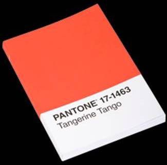
I am so thrilled – the 2012 Pantone Color of the Year is orange, actually Tangerine Tango.  Pantone Inc., the global authority on colour and provider of professional colour standards for the design industries has chosen to “dance into the New Year with this Vivacious and Appealing Reddish Orange”.  Just as Honeysuckle (pink), Color of the Year 2011 motivated us to face everyday challenges with verve and vigor, Tangerine Tango continues to provide the boost needed to recharge and move forward.  Throughout 2011 I wrote a lot about orange and how the colour played a large part in my life and my interiors.  I stated that orange is my new red.  And also, even though orange is made of red and yellow, orange has its own identity and indicates confidence and a sense of playfulness when used in décor.  Everyone has their favourite colour.  I would never say that orange is my ‘favourite’ colour but it is the colour that I notice.  It will turn my head.  It will make me smile.  Case in point; recently while having lunch at Holt’s Café on Bloor Street in Toronto, as usual I was more in tune to the décor than what was on my plate.  On one wall was a huge mosaic done completely in orange.  I found this both curious and interesting all the while noshing on some fancy sandwich.  The sandwich was good, but the orange was great.  So if you are looking for a hit of something new this year squeeze a bit of tangerine into your room!


A Very Mod Merry!

First, I want to wish everyone health and happiness for 2012 and hope that this year may be your best.  Before I close out the ‘holiday theme’ I thought I would share one last Christmas post (do I hear groaning!?) to make mention of the very mod Christmas gifts I received.   Bear with me here.  Observing the ‘Modmissy’ theme my SIL (sister-in-law) gave me a retro-inspired stool/side table that looks like a big white mushroom.  Made of fiberglass with a high gloss white finish, this stool is the perfect addition next to my white leather sectional.  It adds that bit of whimsy to the room.  From my teenage son I got a very ‘groovy’ acrylic tray.  The 70’s-inspired pattern with lime green, pink, yellow, turquoise and of course orange is the perfect tray for sitting on my white credenza.  And of course whenever I shop for others I always find something for myself so I picked up a Ball Chair and Egg Chair.  Only these are miniature versions that don’t sit next to my desk but rather on my desk.  Colourful and inspirational! 


All photos via Modmissy